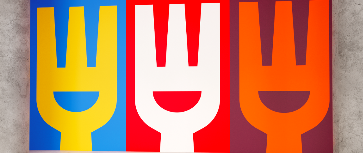
• Cultivated meat—that is, meat produced directly from cells—has only about a decade of history, so it’s not widely understood or accepted by consumers (even though it has great potential to preserve the climate and promote biodiversity). Fork & Good is a cultivated meat start-up that focuses primarily on yummy foods based on ground pork.
Mother Design has created a new brand identity for Fork & Good with a “smiley fork” logo at its center. The smile shape is also used in the full wordmark, as well as in motion applications. From Mother Design’s website: “What’s more, the same cutout informs the ‘bowl’ device in our graphic system—the two-dimensional container for scrumptious meal variations photographed in high contrast—and, paired with chopsticks found in the negative space between the fork’s tines, further represents the universality inherent to the brand’s DNA.”
https://www.motherdesign.com/work/fork-good/
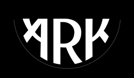
• Ark is a housing option directly aimed at young consumers who can’t afford London’s high rents. Instead, it offers “homely, consciously designed, well connected co-living spaces.”
Design firm Omse has created a brand identity for Ark that mimics the shape of Noah’s ark and also that of a smile. The curved shape houses the wordmark as easily as it can host location names or headlines or signage messaging. The main typeface for the wordmark can also easily be swapped out for other typestyles that might better suited for specific occasions.