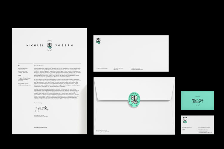
Mother Design has created a new identity for publisher Penguin Michael Joseph, bringing back a familiar character, the book-reading mermaid. The mermaid symbol, in various iterations, has been part of the Michael Joseph system since the publisher was founded in 1935.

Color is a significant element in the identities of Penguin Books and its imprints: parent Penguin uses orange, Puffin has claimed yellow, and Ladybird naturally uses red. Mother Design selected “aquatic-jade,” a cool yet bold color that fits well with the already-established palette.
Although the new Michael Joseph logo does not use the same lozenge surround as the other masks in the family, that shape is suggested in some applications. For instance, the oval shape is used as a sticker, and in some uses, the oval is shaped by the words “publisher” and “established 1935” surrounding the logo.

The intent in choice of shape, color, style of art, and typeface was to create what Mother calls a “future-facing” brand. The new mark will begin appearing on Michael Joseph books in October 2020.
https://www.thebookseller.com/news/penguin-michael-joseph-rebrands-1216595