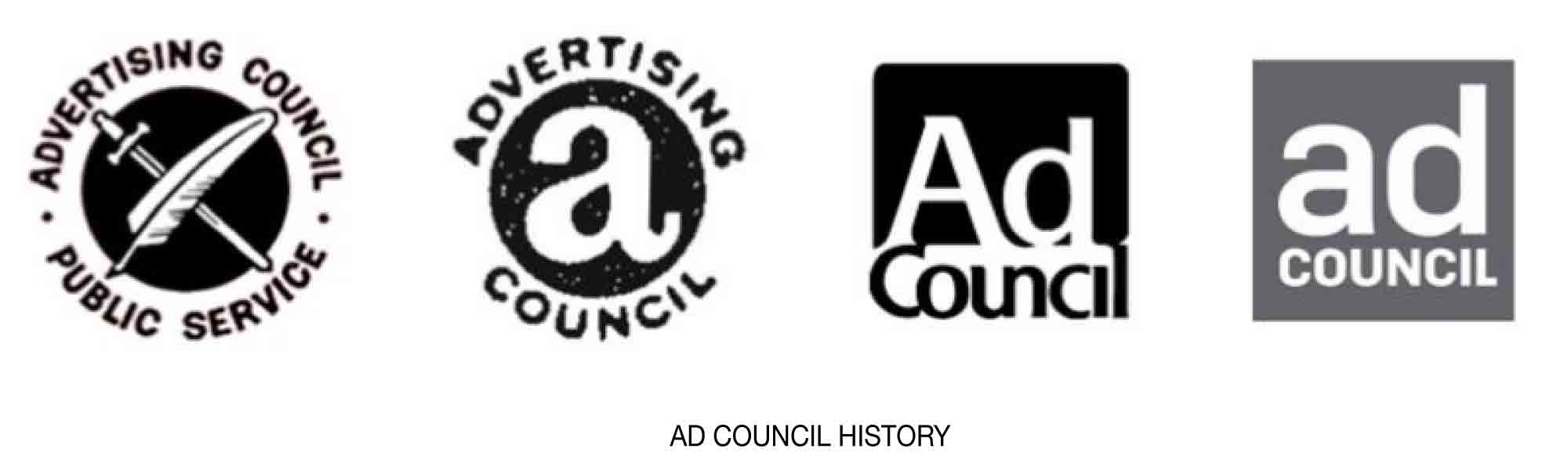
The Ad Council is one of those organizations that has been around for a long time—75 years, to be exact—but not many people actually understand what the organization does. Basically, the Ad Council works with corporations with media budgets to address contemporary social issues such as voter registration, suicide prevention, and fighting opioid abuse. It’s responsible for such historic campaigns as Smokey the Bear, the sale of war bonds, and the “just say no” anti-drug movement.
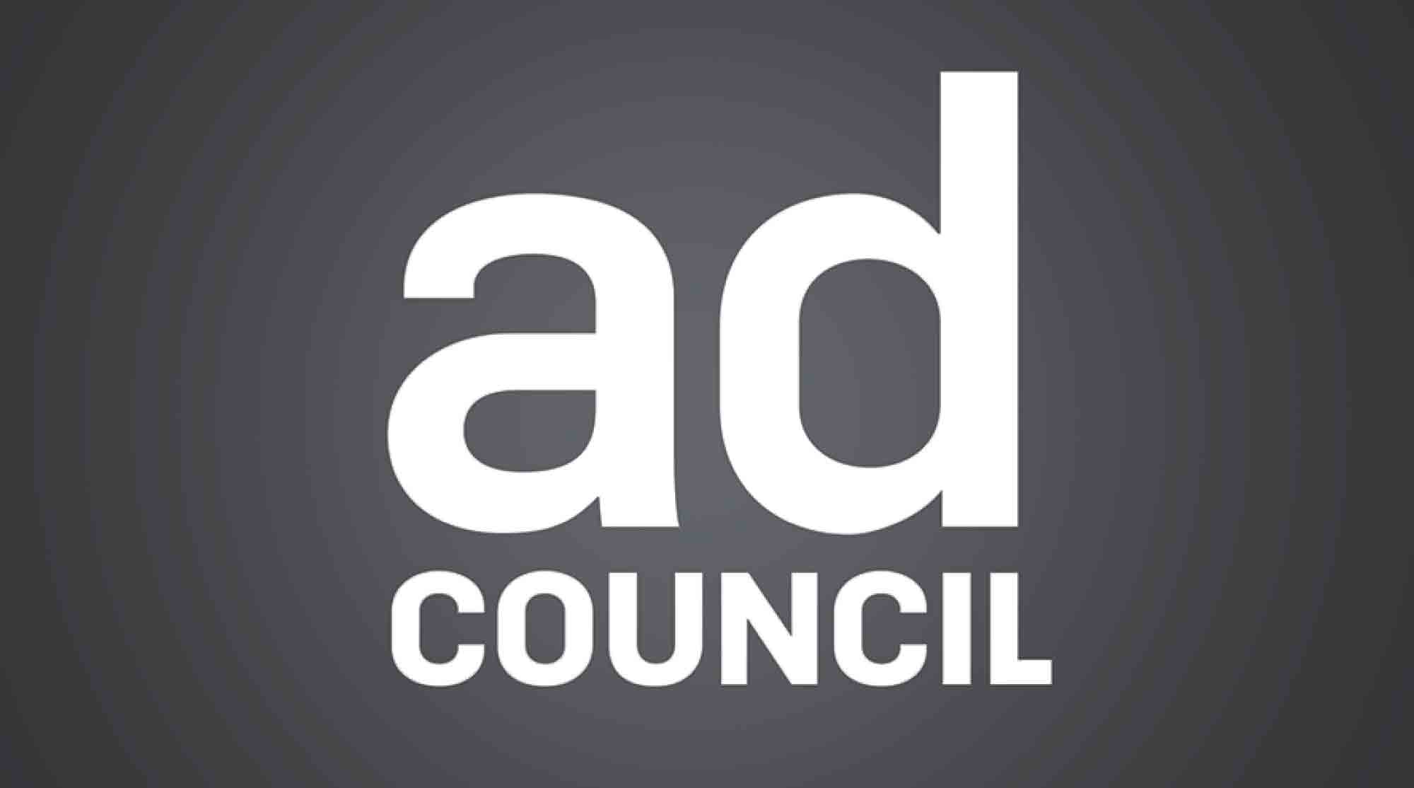
In an effort to reintroduce itself to the public, as well as to newly emerging and non-traditional companies that work on very different media platforms, the Ad Council has a new identity, courtesy of Superunion. The new design uses a lowercase “a” and brings the word “council” into square with “ad, ” creating a sense of strength and stability. Also new is the use of a gray background. It’s less stark and still feels weighty and focused.
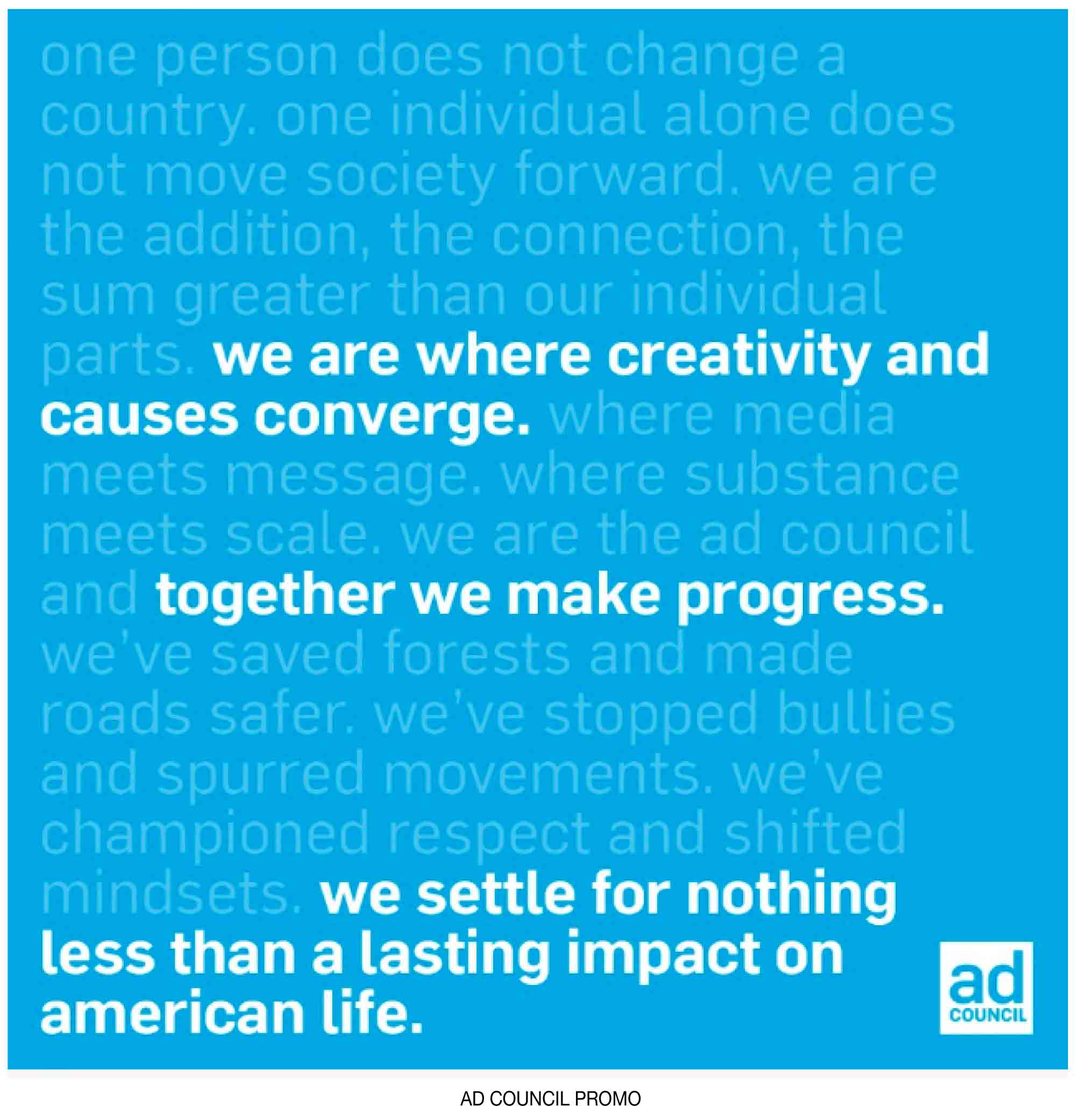
The square, in both flat and dimensional applications, is a repeating design element in the new identity. At times, like in the logo, it is used as a frame. Elsewhere, it is a building block or a connector.
Read more details here.