
While many coffee brands are cozy and earthy, BrewBird is all about making better coffee through technology. Building on the client’s tagline, “Coffee that sings,” design firm Mucho and Scottish artist Craig Black worked together to develop branding for the new company that would look like nothing else on store shelves.
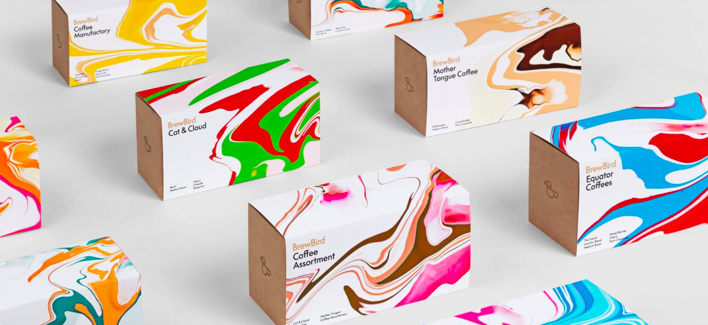
Mucho created a logo that deftly combines the double B in BrewBird to create the outline of a bird. This very simple form is lushly complemented by “acrylic fusion” paintings created by Black. The pour-over paint technique richly references the coffee’s pour-over brewing. The specific paint color combinations suggest the flavors in the various coffees.