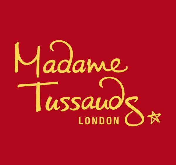
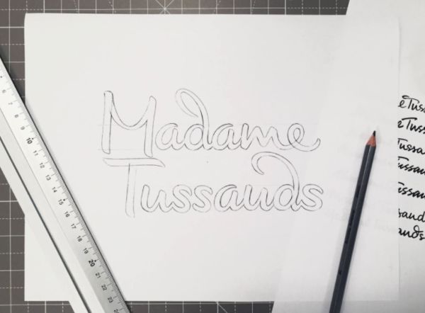
Create an “evolution, not a revolution:” that was lettering artist Alison Carmichel’s assignment from the design firm SomeOne in updating the logo of Madame Tussauds, the world-famous wax figure attraction. Over 250 years old, Tussauds has venues in large cities around the world.
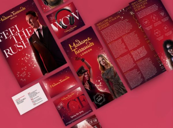
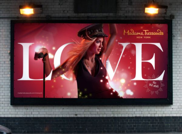
The typographic refresh has more weight than the original version: it’s streamlined and looks much more modern. Paired with “action” photos and an expanded palette of core brand colors, the revised wordmark and marketing are being rolled out in multiple languages in an effort to help Tussauds better compete against the much wider realm of entertainment offerings available today.
Read more behind the new look here.