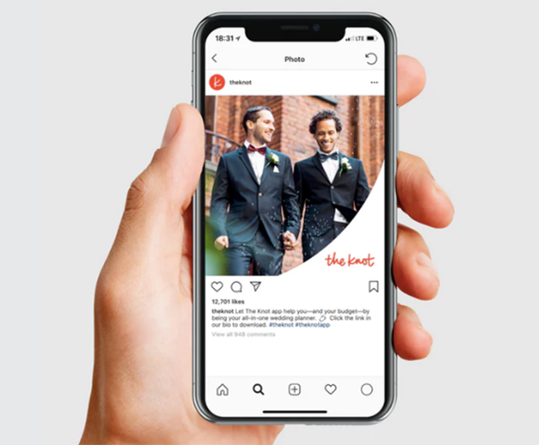
The Knot, a wedding planning app that has reportedly helped more than 25 million couples since its launch in 1996, has a new logo created by Pentagram. The new wordmark is written in a passionate red script, representing love and celebration.
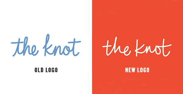
From the Pentagram website: “Like the wordmark, the visual language has evolved to feel more inclusive. The previous identity featured a soft, pale blue (inspired by ‘something old, something new, something borrowed, something blue…’) that is a traditional signifier of wedding–related imagery. The rebrand introduces a striking red that is assertive and passionate. The color is part of an expanded palette that opens the brand to more varied expressions across its different platforms.”
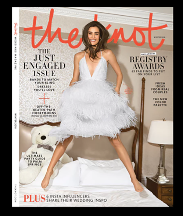
“A supporting vocabulary of graphic elements was derived from the loops and arcs of The Knot signature. The repertoire of forms isolates enlarged details of the wordmark—cropped strokes,ligatures and ascenders of letterforms—for use as background shapes or frames for photography, creating a cohesive experience across the brand. Primary typography is set in Tisa Sans Pro, a modern sans serif that sets off the handwritten wordmark.”