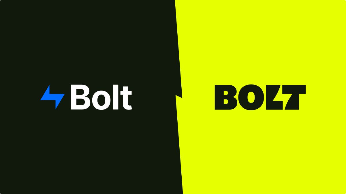
Bolt has developed a checkout platform for e-commerce. Unfortunately, so have many other competitors. Design firm Koto was brought in to help Bolt stand out in this crowded field. Building on the client’s strapline, “shockingly simple,” Koto adeptly used negative space between letters to form an actual bolt shape that is also used throughout the identity. A bright blue from the previous design has been carried over into the new, electric palette.
The design solution navigates two important needs: first, Bolt requires a brand that clearly makes it stand out. Second, the Bolt brand often needs to be secondary to that of the client when used on client interfaces.
From the company’s website: “The new design underlines one of our key features at Bolt: our products can be flexibly applied across a spectrum of use cases. The Bolt brand can stand on its own in the Lightning Yellow shade, and it can also play a supportive role as an ingredient brand to merchants in the Bolt Black shade.”
https://www.bolt.com/blog/introducing-the-new-bolt
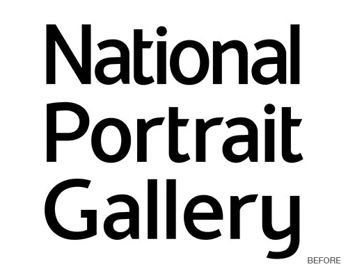
• The National Portrait Gallery in London has a new identity created by Edit Brand Studio and Boardroom Consulting. The rebrand and specifically the logo was inspired by the sketch of an NPG logo created by the gallery’s first director in 1893. The new system also includes a fresh wordmark, a bespoke typeface, and palette.
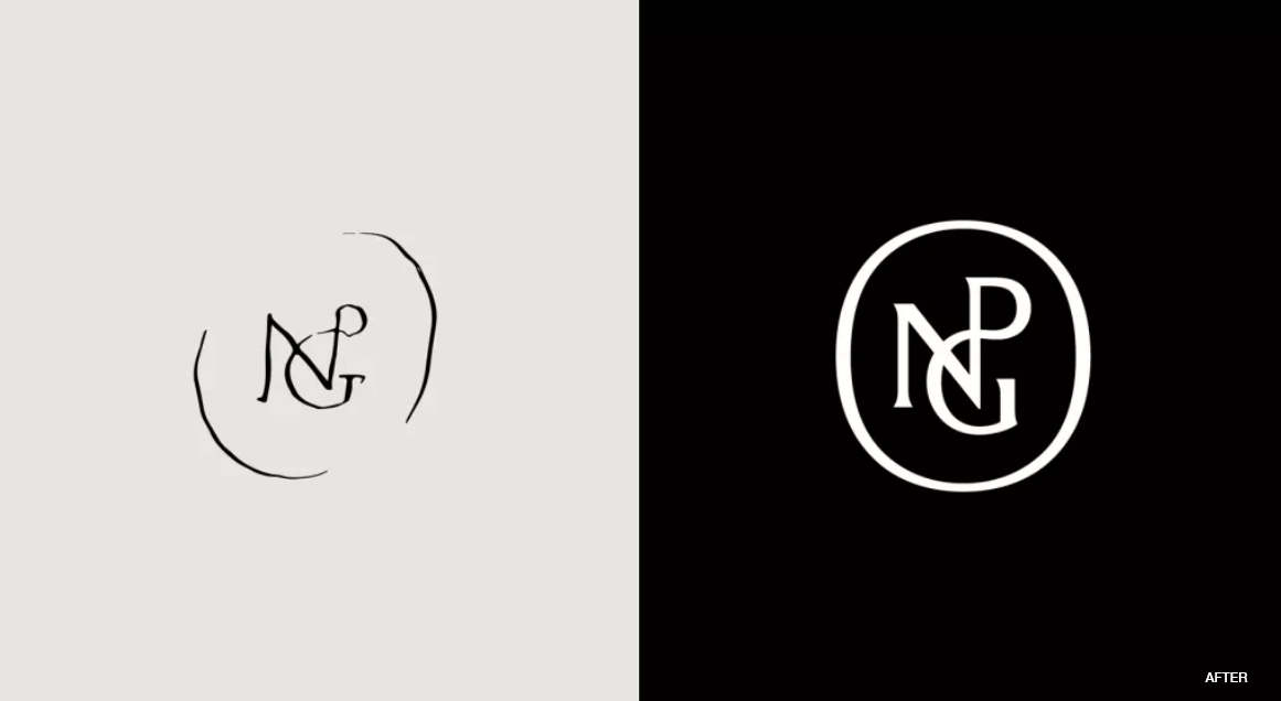
The release of the new identity coincides with the gallery’s reopening in June 2023. The institution has been closed for renovations since March 2020.