Häagen Dazs once reigned supreme in the premium ice cream market, but it has plenty of competition today, especially from small craft producers who succeed by stressing their unique flavors and fresh ingredients. It becomes ever more difficult for a General Mills/corporate product to still appear to be the best ice cream experience available.
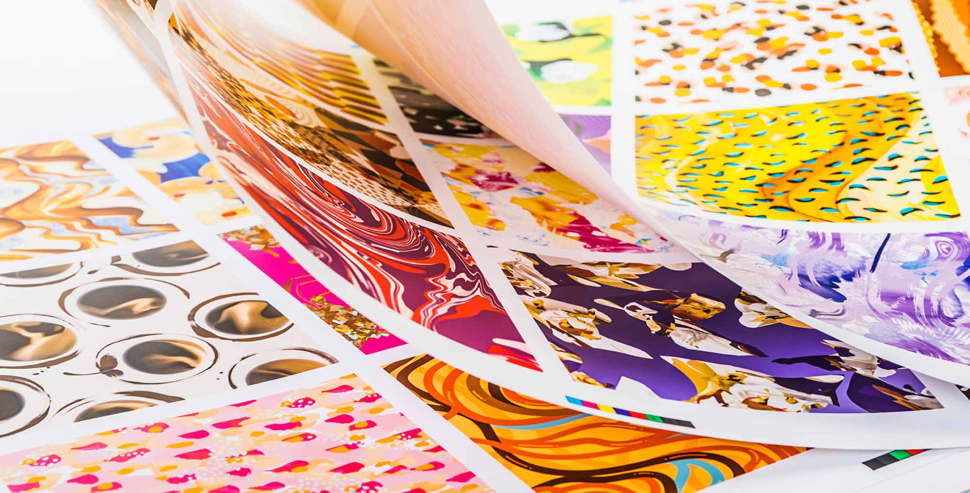
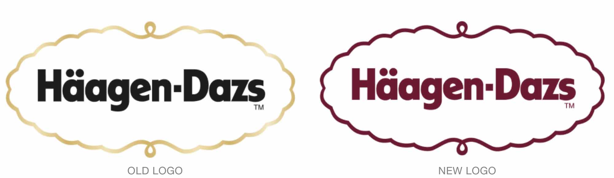
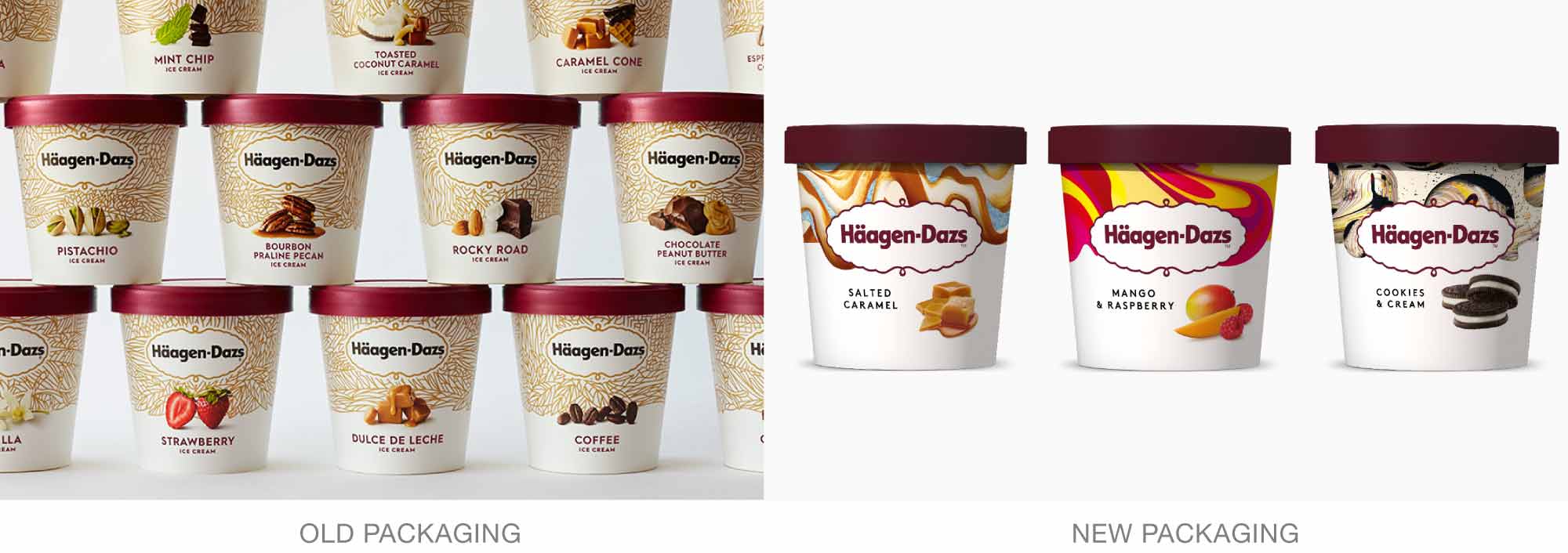
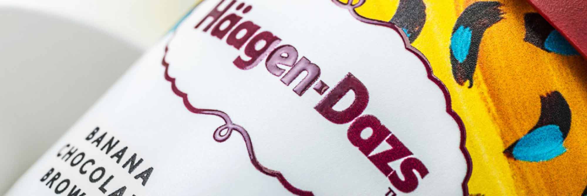
Love Creative worked with Häagen Dazs to bring back the original brand’s sense of a unique and luxurious experience. First, Love simplified the logo from black and gold to an elegant, rich burgundy. It also commissioned artists from around the world to taste all of the company’s flavors and then create art inspired by those products. The diversity and interest the art offers immediately makes the new packaging stand out.
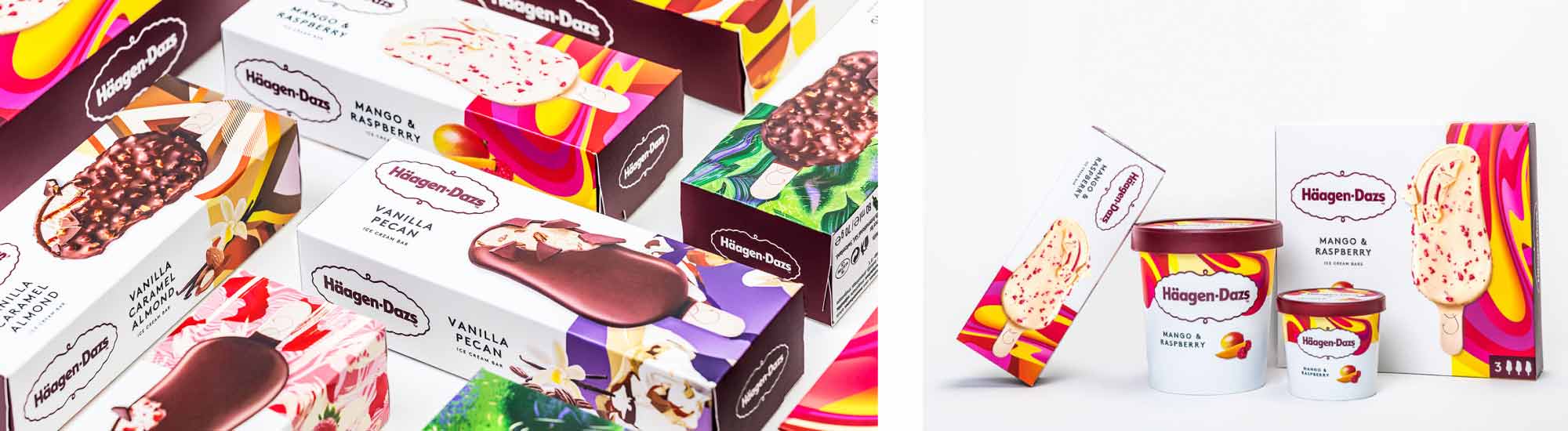
The new designs are already out in the UK and will be rolled out everywhere expect for in the United States by 2018.
Read more details here.