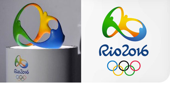
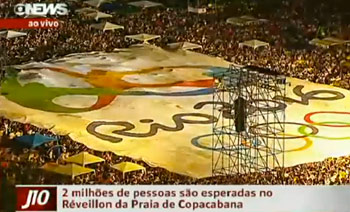
The logo for the 2016 Olympic Games in Rio de Janeiro as revealed near midnight on Friday to thousands of New Years Eve revelers on Copacabana Beach. The new mark, created by the Rio design firm Tátil, was chosen from 1f39 identities submitted from agencies across Brazil.

In addition to the requisite vibrant colors and sense of celebration, there’s a lot to see in the new design—people uniting, of course, but also the shape of the city’s landmark Sugarloaf and the subtly embedded word “Rio.”

From Tátil’s web site: “Together, different countries, athletes and peoples embrace in an individual and collective motion that reveals one of our city’s landmarks — a vibrant Sugarloaf, pulsating with joy, union, celebration and friendship.”

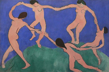
There have been cries of plagiarism from some, who say the new mark looks too much like the logo of the Telluride Foundation (which others point out looks much like “The Dance,” by Henri Matisse). But response overall has been pretty positive, or perhaps relieved, given the dismal reception several years back of the identity for the 2012 London Olympics.