
Have you seen a noteworthy new or redesigned logo or identity? Been amused, edified or otherwise affected by developments in the larger world of logo design? Please share news with the international LogoLounge.com community by emailing cathy@logolounge.com.
MapQuest seeks out new logo
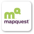 Wolff Olins has developed a new logo and identity for MapQuest. It's clean and modern and was designed to take the emphasis off of simple online mapping. Instead, the new identity is meant to stress the service as an integral part of your life.
People see different things in the new logo-a little animal, map-to-the-power-of -your-quest, or simply a much-needed modern revamp. The purple and bright green mark is just part of the revamp: The site itself is more user-friendly and certainly more flexible.
new.mapquest.com | brandweek.com
Communication Arts typographic competition
 Communication Arts magazine is sponsoring a typographic competition designed to celebrate the best use of typography and also to connect type designers, calligraphers and hand-letterers with their potential customers: designers and art directors.
Judges will be Stephen Coles, Allan Haley and Ellen Lupton, and deadline is Sept. 10, 2010.
commarts.com
Qatar's 2022 FIFA logo
 It seems a bit premature, but the soccer world cannot be matched for its extraordinary planning. The UK-based Lambie-Nairn consultancy has created a new identity system for Qatar's 2022 bid for the Fifa World Cup.
On a related note, learn how the identity for Qatar's 2011 Asian Cup event was created by FutureBrand in LogoLounge: Book 6, which will be available Fall 2010. Watch the LogoLounge web site for details.
tradearabia.com
Team logo incites riot
 Logo redesigns for schools, cities and sports teams often bring out the ire of opinionated citizens: "Any change is a bad change" is the usual sentiment.
But the unveiling of this team's logo had more effect than usual. Sigh.
opposingviews.com
Apple goes "dif"
 After suing the pants off of any entity who dares to use even the slightest reference to the hallowed fruit in other identities, Apple has decided to go really, really minimal-leaf only.
"Leaf, apple ... apple, leaf - the eye never knew where to focus. The solution is pure Apple. Or, I should say, pure leaf," says an in-house designer who was not identified. Next step: negative bite-mark space only.
scoopertino.com
Facebook mystical, mystery logo
 Facebook's mission statement-as-logo is not for the weak-at-heart.
In fact, the entire interview in which a sweaty Facebook founder Mark Zuckerberg inadvertently reveals what was hitherto an in-house-only mark makes one feel oddly uncomfortable.
news.cnet.com | dailyfinance.com
TCBY reveals logo in prototype store
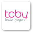 TCBY has revealed its new logo, which will replace its original 30-year-old design.
There are various versions of the new logo in the rumor mills at present, and photos of the prototype store, to be opened in Salt Lake City, do not show the same logo as what is reported to be released. In any case, the new identity is sleeker and simpler.
If the new store design, created by Salt Lake City-based StruckAxiom, proves successful in two corporate-owned prototype stores, it will be offered to franchisers
qsrmagazine.com
Mello Yellow Goes Retro
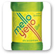 The soft drink Mello Yello has gone retro, with a throwback logo created by the New York firm Stag & Hare. The new logo is a tilted version of the original 1979 logo.
thecoca-colacompany.com
New Cadillac logo in motion
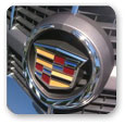 The "wreath and crest," Cadillac's familiar logo that was redesigned late last year, is starting to show up on products.
The redesign is more jewel-like, with richer colors and raised dividers between sections of color.
nytimes.com
McGladrey & Pullen tee up logo
 A really, really big cake was part of the rebranding launch celebrating the marriage of Bloomington, Minn.
Based RSM McGladrey, it is one of the nation's largest tax and consulting firms, with assurance partner firm McGladrey & Pullen.
mcgladrey.com
Miller High Life identity redesigned

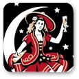 Landor San Francisco has reworked the identity for Miller High Life.
The elements are largely the same, although the familiar girl in the moon has more prominence in the new plan. Unfortunately, she still has that disturbing goatee...
thedieline.com
Crayola refines their logo
 Artist Henk Dawson was called upon to make some modifications to the Crayola logo adopted in 2003. A desire to give an even greater dimensionality to the mark using highlights and beveling has led to some very subtle changes.
The attached video gives some insight into the actual rendering process. No information is available on whether all 64 colors were actually used.
d3d.com
Stern Pinball's new logo
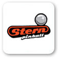 Stern Pinball has a new logo and website designed by Core 12. According to Stern the new identity will place them "at the center of the pinball universe," which I always assumed was in my uncle's basement.
Vintage names like Bally, Gottlieb , and Williams aside, the Stern Pinball site claims the company to be "the only maker of REAL pinball games on the planet". With the influx of digital games, the pinball machine with their highly intense package of bumpers, lights, bells, and gizmos starts to build a case for it's own extinction.
A need to rely on a visual depiction of the flipper striking the ball for a logo may only be the first sign that there is a generation of gamers that may never have seen an actual pinball. Now that arcades have been reduced to a hand held personal gaming device you can be assured that "3 plays for a quarter" will mean absolutely zip.
vendingtimes.com
Wembley Stadium's new logo
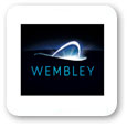 Wembley Stadium is now just Wembley and with a new logo to complete the transformation. Arguably one of the most recognized sports venues in the world, this stadium owned by the FA Group makes the official shift to a one word moniker much like Prince or Madonna.
Leaves us to wonder when Eiffel will drop the whole Tower baggage it's been lugging around for better than a century. The new mark created by Bulletproof reflects a dynamic update to the former identity adopted in 2002. Playing off of unique upper profile of the stadium.
The solution in full glory depicts the excitement of a nighttime event with a nimbus of light spilling out of the top of Wembley. The complete press release for this project outlines the history of the Stadiums visual identity and also depicts a much more simplified vector edged version of the logo.
wembleystadium.com
Noteworthy ...
 Astral Media has a new logo, created by Juniper Park.
Home Delivery Network has rebranded as Yodel.
marketingweek.co.uk
Microsoft Tag has a new identity with which it hopes to resurrect a technology that flopped in the dot.com era. Instead of using a proprietary reader with which to read tags, consumers can use their cell phones to scan marks.
thenextweb.com
Logos for lunch
 Now you can have your logo and eat it, too-literally. Sports merchandisers have found ways to put an edible logo right on a pizza and how to sear it into toast. Panini sandwich presses are next, sources say.
usatoday.com
BP = Basically Pathetic
 As oil continues to vent in the Gulf, designers are starting to vent as well. Greenpeace UK has launched a competition to redesign BP's logo, which might be just the sort of outlet some of may be needing at this point.
The brief is to show that BP is certainly not "beyond petroleum." The winning entry will be used in Greenpeace efforts against the company. Entries will be judged on concept and idea; the final logo will be brushed up by a "top graphic designer," according to the web site.
There are three categories: professional designers and design students; the general public; and those under 18. Enter before 5:30 GMT on June 28, 2010.
greenpeace.org
Hello JELL-O!
 Kraft Foods is reuniting Bill Cosby and JELL-O once again in a new advertising campaign and identity system.
In addition to pitching by the famous comedian in a new web series, new commercials, a national giggle contest, sidewalk stencils, a Facebook fan page and lots of print advertising will promote the new identity.
marketwire.com
Indian ID logo shown
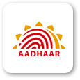 The halo of the sun rising over the imprint of a thumb make up the new logo for the Unique Identification Authority of India (UIDAI), which will now come under the new name AADHAR.
The new identification system will assign a 16-digit unique identification number to each Indian citizen.
beta.thehindu.com
Noteworthy ...

 Seattle's Best new logo not proving popular.
The London Design firm Construct has produced a witty, flexible identity scheme for the luxury hotel Claridges.
www.formfiftyfive.com | www.claridges.co.uk
GMAC Financial has rebranded as Ally Financial.
www.mybanktracker.com
Golden State Warriors make fans search for the team's new logo.
www.graphicology.com | espn.go.com
Waterstone's Booksellers has a new mark.
www.creativereview.co.uk
McDonald's brand ambassador gets to stay.
www.usatoday.com
Olympics organizers unable to resist temptation to create mascots/sell merchandise.
winnipeg.ctv.ca
What is the symbol for the new Europe?
 The current European flag has not changed since it was created in 1955, while European society has changed drastically. Designers from around the world were asked to re-envision a new flag, and more than 1400 responded.
A jury has selected 12 intriguing designs. Their art and the conversation it will evoke will be part of an exhibition and debate featuring members of the European Commission and designers who will discuss Europe's new identity.
www.designdenhaag.eu
Dodge Ram gone, slashes are in
 With its truck and sports car divisions now separate, Dodge is replacing its long-familiar Dodge Ram logo with the two red stripes from its SRT (Street and Racing Technology) division. The manufacturer hopes to reposition itself as a more attractive option for younger consumers.
The slash will appear on dealer signage, ads, merchandise, owner's manuals, and other promotional products, but not on vehicles, for now. The Dodge name will stand alone in a new script until the 2011 Dodge Charger rolls out of the production line. The Charger, along with a still-to-be-named crossover, will be the first vehicles to sport the new Dodge "Twin Slash" logo.
SRC rebranded as Alteryx
 MetaDesign has created a new identity system for Alteryx, formerly SRC LLC, a leader in the field of geographic business intelligence software and services.
At the core of the new identity are overlapping trapezoids which show how integrating diverse concepts can create something entirely new. The main colors are blue, green, and yellow, conveying aspiration, growth, and creative energy, according to the MetaDesign site.
www.metadesign.com | www.alteryx.com
Second annual dollar redesign contest

 In rethinking the U.S. dollar, the Dollar ReDe$ign Project aims to rebuild public confidence and improve the economy. From a design standpoint, though, it's just plain fun.
The web site shares last year's winners, recent submissions, insight on what currency actually is, as well as some outstanding ideas from Herb Lubalin, Seymour Chwast, Bob (R. O.) Blechman, Edward Gorey and others, first published in AvantGarde magazine. (The latter can be found under See All Submissions.)
Deadline for this year's contest is-of course-July 4, 2010.
richardsmith.posterous.com | blog.eyemagazine.com
Fortis rebranded as ageas
 After being granted shareholder approval in late May, the insurance group Fortis will gradually introduce its new name, ageas, in the UK (lowercase intentional). Fortis profits were tumbling in March when the name change was first announced.
Before you run for the dictionary, the following is an explanation of the name from a company-released press release:
The first two letters honour our roots: they have been synonymous with excellence since the creation of AG Leven in 1824, and represent over 180 years of know-how and experience in insurance and banc assurance.
The 'e&a' at the heart of the new name refers to our two key markets: Europe and Asia, the combination of which accounts for the lion's share of the global insurance market. This international character is an essential part of our identity: ageas employs 10,000 people, each with their own individual talents, cultural background and expertise, but united by a common vision. We are part of the fabric of the local communities in which we operate, allowing us to adapt more easily to market conditions and customs.
The final 'as' stands for 'assurance' and a single-minded focus on our core insurance business. Nothing more, nothing less. Our ambition now is for ageas to become the benchmark for the insurance sector. Like our group, the name 'ageas' is more than the sum of its parts. It derives from the Latin word 'agere', meaning action, drive, and a conviction to forge ahead.
From another company release, an explanation of the rings: They "express a sense of energy and desire to get things done wherever the company does business around the world."
www.ifaonline.co.uk
Glasgow Underground new logo
 The 100-year-old Glasgow Underground has a new identity, created by the design company Strand.
A brand audit by the design firm revealed inconsistent use of color and fonts. Also, some parts of the subway uses an older "U" logo, while others use an "S." It is the brand's first update since the 1920s.
www.thedrum.co.uk
Aussie cigarettes go brutal
 Australian prime minister Kevin Rudd is pushing a plan for his country that would forbid logos, colors, brand imagery or promotional text on cigarette packaging.
By 2012, the new packages would all have to have the same color, font style and element positioning under the proposal. Existing gruesome health warnings and pictures will remain, including photos of a gangrened foot, a mouth with cancer, and cancerous lungs. In addition, taxes on tobacco will be raised.
Tobacco companies are threatening suit.
www.dailymail.co.uk
Noteworthy ...
 Legend passes away
Little known but much-admired logo designer Don Ervin has passed away.
tmagazine.blogs.nytimes.com
Marlboro logo end-run
Is Marlboro blowing smoke in the face of European Union rules against cigarette advertising with subliminal logos?
www.graphicology.com
Downtown Sacramento is showing off its new logo
www.bizjournals.com
Continential / United brands unite
 Two very familiar identities in airline travel were smooshed together this week.
The new "bidentity" (or is it "flydentity"?) will keep the Continental name and the logo and colors of the United brand. It was an amalgamation likely concocted in the interest of time, and it seems impossible that we wouldn't see a totally new logo within the year. But it's a shame that what is now the largest carrier couldn't have done something more inspiring than cherry-picking components and Scotch-taping them together. Witness the merger of Dresdner Bank and Commerzebank in Germany in 2009. MetaDesign deftly combined the identities of both historic brands-saving valuable components of each-into an fresh identity that employees and customers alike could continue standing behind.
The Continentited logo, on the other hand, has an odd, almost punked feel, like the new Sarah Palin brands Felix Sockwell created for a recent issue of New York magazine.
www.unitedcontinentalmerger.com | www.csmonitor.com
See Felix's art at...
drawger.com
Auckland's new logo
 To a chorus of dismay equal in some ways to the reaction to merging metro-area itself, the new Auckland super-city logo has been revealed.
Auckland's eight local councils are set to merge into a mega-city, with its own identity and flag. The winning design, a stylised pohutakawa flower (shown in photo), was chosen from over 1500 entries in a public competition run by the Auckland Transition Agency.
tvnz.co.nz | www.nzherald.co.nz
Edmonton Public Library new logo
 The Edmonton Public Library has a new logo that is being nicely played out in print and onscreen ads.
The new system was created by Donovan Creative Communications, also of Edmonton. Full of color and energy, the new identity is the sort of promotion that makes libraries not only feel relevant in the 21st century but a place that you'd really like to spend more time.
www.facebook.com
New business
 Business Week now Bloomberg's Business Week, mind you has a new identity that very much resembles that of a traditional newspaper.
The new identity is decidedly less colorful: The most recent cover has a very graphic, photographic feel. Some say the magazine was resculpted to look more like the Economist.
www.medialifemagazine.com
Chrysler logoplay
 Three designers share their visions of what Chrysler might be. Their designs might be in part tongue-in-cheek, but their reasoning is sound.
autos.aol.com
The Beaver

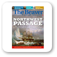 The Internet: marketing boon or nightmare. Ask the publishers of The Beaver, Canada's second oldest magazine, whose e-newsletter and other marketing materials were being blocked by spam filters.
"There were some really unfortunate but practical reasons why The Beaver couldn't be the universal brand," said Ms. Morrison. "That's the factor why it was a deterrent - particularly amongst women and people under the age of 45."
The magazine has been renamed Canada History. Its publisher and editors will take advantage of the rebrand opportunity to rework other parts of the publication as well.
www.webuser.co.uk
New Hon logo
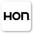 The furniture company HON has introduced its first new logo in 40 years.
HON (a wise acronym established long ago to replace Home-O-Nize) creates workplace furniture. The new mark is a more rounded, caps/lowercase version of the previous mark. It's certainly a more comfortable-looking design, appropriate for a group that designs and manufacturers seating, among many other items. But the company's goal was simply to look more friendly and approachable. Don't we all.
ceg-pa.com
Find that typeface
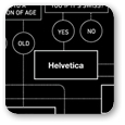 You cried while watching Terminator? What is your opinion of Eric Gill? Check out this hilarious chart for finding just that perfect typeface for any project.
inspirationlab.files.wordpress.com
"Live in the Know"
 The Wall Street Journal has launched a new multimedia brand advertising campaign with the tagline, "Live in the Know."
With newspaper sales flagging, many papers are trying to reintroduce themselves to the reading public, especially its younger members. The tagline just part of a campaign that aims to show that the paper isn't all business, but that it also delivers news on lifestyle, health, fashion, and more.
The campaign will appear in print, online, cable television, and various broadcasts.
www.dowjones.com
Adobe releases CS5
 Inspire writer Shawn Cheris has pulled together a concise visual essay on how the new CS5 identity system was developed. The article shares some early prototypes that really detail the roots of the design.
It's fascinating to learn the origins of the new identity, especially when there are other systems afoot that have a similar faceted look-the City of Melbourne and Casa da Musica (both projects will be covered in the new book, LogoLounge 6, to be released later this year)-but which have completely different reasonings behind their designs.
xd.adobe.com
"Studio with Plaster Head" by Pablo Picasso
 Pictaculous is a fast, fun tool for selecting colors to successfully accompany a photo or other image file.
In just seconds after you upload an image, it returns a palette based on tones in the image - clearly, something a designer could do him - or herself, but it's much quicker. Even better, it instantly provides you with an Adobe Swatch file. And it's free ...
www.pictaculous.com
Celebrating Earth Day
 Whether you agree with Greenpeace or not, please enjoy this amazing video, in honor of Earth Day.
www.greenpeace.org
2016 Olympics in Rio
 The search is on for the new logo for the 2016 Olympics in Rio. The logo that the city used as a candidate city is shown here. Its distinct shape comes from the shape of the city's distinctive and inspirational Sugar Loaf, shown in the photo.
The logo's creator, designer Ann Soter says about the mark, "The Sugar Loaf in the shape of a heart represents the Brazilians' indisputable passion and vibration for sports. The exclamation point replacing the numeral 1 in the writing 'Rio 20!6' symbolizes Brazil's heightened expectations with the chance of hosting the event."
The call for entries for the actual logo of the games was issued this week, and the first deadline is April 30. The new look for Rio 2016 will be unveiled during the New Year's Eve celebration at Copacabana, just over eight months from now.
www.aroundtherings.com | www.rio2016.org.br
Inside Felix Sockwell's studio
 There's just about no one whose creative process is more elucidating and fun to watch than Felix Sockwell's.
He's incredibly generous about sharing the way he works. In a recent pro bono piece for a local library, he lets you see everything from the letter from the client and plenty of sketches to ruined prints from his Yuda machine and photos of the aftermath in his studio.
www.drawger.com
Noteworthy ...
 Salvador Dali as logo designer?
Windows Hotmail has a new logo, its first.
erictric.com
Disney applies for new trademark for revised logo.
www.stitchkingdom.com
Under Armour logo under scrutiny by citizens.
World Urban Campaign logo chosen.
www.worldurbancampaign-logo.org
High fashion tattoos

 Body paint and skin drawings were hot on this season's fashion runways. Chanel is capitalizing with a temporary tattoos that promote the brand and its essence.
Les Trompe L'oeil de Chanel, a set of 55 individual tattoos, will be available in March.
www.elleuk.com
Landor brightens colors
 Landor design director Jack Bredenfoerder says in 2010 there will be a major shift away from the cautious neutrals, grays, browns, and blacks seen so much in 2009.
Instead, a refreshed palette that includes unifying, global blues, white and warm golden yellows will emerge, as will 1960s pastels for spring and summer. In the fall, those pastels will deepen into dramatic, rich, stable browns, blues, reds and purples.
www.landor.com
Typefaces that can save you money
 Some fonts simply require more toner/ink to print than others. So why not specify those for client systems?
A recent study revealed that the following fonts can be ranked from those that use the least ink to those that use the most: 1. Century Gothic; 2. Times New Roman; 3. Calibri; 4. Verdana; 5. Arial; 6. MSSans Serif; 7. Trebuchet MS; 8. Tahoma; 9. Franklin Gothic Medium.
Of course, these aren't usually the fonts dream identity systems are made of. But if they can be specified, they will save you or your clients in toner cartridges, at the very least.
www.chron.com
Belgrade Fairground logo
 Designers Mirko Ilic and Milton Glaser have created a logo that has helped jumpstart efforts to reclaim the site of the 1937 Belgrade Fairground, which became a Nazi concentration camp in 1941.
They and campaign organizers want to turn the site into a monument dedicated to the approximately 7,000 Serbian Jews, mostly women and children, were systematically murdered there.
The logo combines the colors of the Serbian flag, as well as images of smoke and water, representing fire and tears.
tmagazine.blogs.nytimes.com
"Rethink Possible"
 In an effort to get all of its channels of communication looking in the same direction, AT&T is looking that a rebrand that hopes to reposition the company as a lifestyle choice and not simply yet another phone company.
"Rethink Possible" is the tagline that will accompany the new campaign. The familiar globe logo will undergo some interesting changes (by Interbrand), namely the drop of the AT&T name and permission to get away from the company's familiar orange. Watch the video at the company's microsite for a flush of addition (possible?) variations.
www.att.com/rethinkpossible
The Japan Tourism Agency has unveiled a new logo and campaign
 The new logo is accompanied by a new copy "Japan, Endless Discovery," and is designed with Japan's iconic cherry blossom element, which represents Japan's natural beauty, tradition, culture, cuisine and arts.
While promoting the country's traditional attractions, the logo also visualizes Japan's modern cultural interests in an effort to appeal to a younger generation of tourists.
www.travelagentcentral.com
Duffy's new Water for People brand
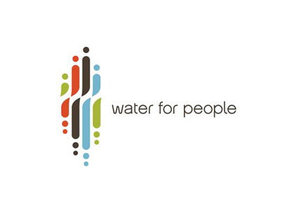
 Duffy & Partners has created a new brand and logo for Water for People (www.waterforpeople.org), a Denver-based international development organization that supports sustainable safe drinking water and sanitation projects in developing countries.
The logo combines the concepts of the human form in its many sizes and color varieties with that of flowing water. It symbolizes people working together to provide a safe, strong supply of drinking water for everyone.
"This was an exciting assignment," said Joe Duffy, creative director of Duffy & Partners. "It was a fabulous opportunity to deliver our mission of creating design to enrich everyday life and deliver a powerfully unique design solution that reflects Water For People's vision of a world in which all people have access to safe drinking water and are free from sanitation related disease."
www.duffypov.com
Noteworthy ...
 Sunkist UK rebrand
Wikipedia tweaks logo and updates user interface.
news.cnet.com | meta.wikimedia.org
Eco Coke bottle design
 For a classroom project at the College for Creative Studies (a freshman project, no less), Andrew Kim has created an intriguing product design for Coke brands.
His square bottle design produces a smaller bottle footprint - which helps in storage and transport); its cap uses less materials; is stackable; is collapsible for easy of recycling/storage; and the bottle is made of 100 percent sugar cane by-products. Yet the design maintains the brand ID very well, despite the fact that it seriously toys with the iconic bottle shape.
designfabulous.blogspot.com
UK Space Agency gets new logo
 The UK Space Agency, to be launched April 1, has a new logo that has generated a lot of discussion.
Created by Folio Creative, the mark certainly has a sense of energy and movement. Some have criticized it for being too prototypically British-Union flag, red-white-and-blue, plus Gill Sans.
But perhaps the best criticism so far is from Doctor Who fans, who claim it looks just like the British Rocket Group logo used in the TV show. That is perhaps a bit too far out.
news.bbc.co.uk | www.metro.co.uk
"I'll Topeka it"
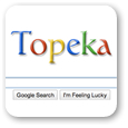 Relenting to ongoing and unrelenting pressure from Midwestern identity lobbyists, Google today changed its name to Topeka. The move took patrons and staff alike by surprise.
"I would have picked Lincoln," says Miriam Horslanger, a now-Topeka customer service rep. "It sounds better to say 'I'll Lincoln it,' rather than, 'I'll Topeka it.' I mean, it sounds like you're gagging or something."
"It's a dangerous move," says a West Coast art director who asked not to be named for this story. "They should have consulted us first so we could have applied our patented Brand Unearthment Methodology. If you consider 'Google' as a person, you would see that he is a curious, helpful, friendly sort-he has lots of outside interests, flosses regularly, likely runs in marathons, and drives a Prius. But 'Topeka'? What is that supposed to mean? My intern says it's the name of a city, but honestly, it sounds like the name of a drug for urinary tract infections."
The company will maintain its readily identifiable, multicolor logo style, although the shadow-considered a bit too satanic in some Midwestern areas-will be dropped. Users who continue to enter "Google" as a destination address will be automatically redirected to a site where they will receive instruction on how noodling around on the Internet for hours does not support a good work ethic.
Sinapore's new logo
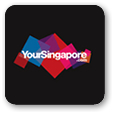 Singapore's culture is like a kaleidoscope, with many languages, cultures, customs, and peoples, all living together in a cosmopolitan city-state.
So it's fitting that its new tourism web site, yoursingapore.com, has a logo that is also kaleidoscopic, composed of squares of transparent color all playing off of each other. The logo and its rich colors are also meant to represent the many and diverse stories that residents share and visitors will take away when they visit Singapore.
www.yoursingapore.com
Yellow Pages Group gets a new logo
 Yellow Pages Group (Canada) has presented a new logo and ad campaign that includes a streamlined set of the famous trademarked fingers and a lot more yellow.
 Missing, though, is the image of the open book below the fingers as the company tries to downplay the "pages" part of Yellow Pages. The fingers are now perched on a three-dimensional button, suggesting the company's role in digital media (the company calls the button a "pebble"). The identity's yellow is now much purer; gone is the gold of old, but the mark is clearly recognizable as representative of Yellow Pages.
www.theglobeandmail.com
New mark for Expedia
 Expedia's logo was streamlined earlier this year, and now the travel source has modified the mark yet again for European markets. The Martin Agency says the redesign is "less whimsical and more sophisticated."
You can still sing "dot com!" whenever you wish.
www.expedia.co.uk
Flashback design
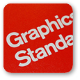 A cool glimpse inside the New York City Transit Authority Graphics Standard Manual, created in 1970 by Massimo Vignelli.
www.flickr.com
New Wood's / Nike logo
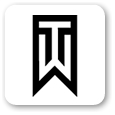 Putting just the right spin on the ball...
Never mind that AT&T already severed ties with the golfer back in January. "We are not actively pursuing new business partnerships at this point in time," said Mark Steinberg, Woods' agent, in what may be the understatement of the year.
www.msnbc.msn.com
Origin of the @ symbol
 In a move reminiscent of The Onion's historic reporting of the U.S. military airlifting cases of A's, E's, I's, O's and U's to vowel-striken countries such as Kyrgyzstan, the Museum of Modern Art has "acquired" the @ symbol for its collection.
The intent of this move is curious indeed, mystifying many. Apparently, with this move, curators are now free to acquire anything for their collections, real or conceptual. One wonders how soon the @ will available for inter-museum loan or traveling exhibitions.
Regardless, the explanation of the historic origin of the @ is worth reading the entire (tongue-in-cheek?) release from MoMA. Be sure to read the comments as well-they add even more interesting information.
www.moma.org
New brand for Budgens and Londis stores
 Pentagram is redesigning the entire brand range for Budgens and Londis stores, including its Good, Better and Best lines.
The first three redesigns for the wine, beer and spirits Better line are shown here. Each label is based on a large initial cap, but is distinctly different. There is a familial feel. Yet the treatment, which will be played out on many more packages, remains intriguing and fresh.
pentagram.com
Drawing 101
 It's a double-bill: Milton Glaser talks about the importance of drawing - and demonstrates the same and, duly inspired, Rick Valicenti of Thrist also takes up the topic.
happenings.3st.com
Effective and beautiful

 Zeus Jones, over the past two years, has created four new collections for Thymes, creating a graphical brand presence that really stands out in the category of gift products.
After completing a full audit of the gift category, Zeus Jones designers discovered that it could be split into two groups: brands that stressed efficacy but failed to effectively use design, and brands that were pretty, but not very effective. Thymes, they believed, was a quality product that was also beautiful, and so set out to show just that in the new lines.
The designs nicely build upon the Thymes brand, which has long been known for its constant renewal and strong identity.
www.zeusjones.com
Noteworthy ...
 MTV revamps in the UK and Ireland.
German designer Thomas Manss creates a fresh logo for The Benjamin Foundation.
www.benjaminfoundation.co.uk | www.northnorfolknews.co.uk
View most of the 2012 FIFA World Cup jerseys at...
bleacherreport.com
Glasglow 2014 new logo
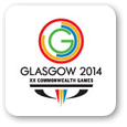 The Glasgow XXth Commonwealth Game revealed its new identity in early March-and immediately wished it hadn't.
The online design press went crazy last week, pointing out the uncanny similarity of the new logo to the Glasgow Common Guild. Both were created by Marque Creative (GCC in 2007). Some have called for a discount or refund; others have simply voiced their displeasure or have pointed out that the new mark also closely resembles the Covent Garden logo.
Neil Baxter, secretary of The Royal Incorporation of Architects in Scotland, comments, "It's colorful, it's lively but it's derivative. The skill of the designer is to come up with an innovative and original design to fit the brief, and that should not be 'one we made earlier'. I do feel that while people may have a house style or whatever, you should really be avoiding something that is similar to one you did some time ago."
A Games spokesman says, "The Glasgow 2014 brand went through very rigorous testing against existing trademarks and brands. We believe there will be no issues arising from any similarity that people might see.
www.glasgow2014.com | www.thecommonguild.org.uk
www.coventgardenlondonuk.com | news.scotsman.com
Noteworthy ...

 2010 Rebrand 100 winners announced.
An insightful collection of quotes on design, set up as a screensaver.
neography.com
A new logo design for the Qatar Financial Centre Regulatory Authority.
www.gulf-times.com
Colle+McVoy gets a makeover
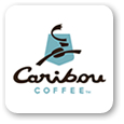 Colle+McVoy has created a new logo, color palette and design elements for the 17-year-old Caribou Coffee company.
The new identity is full of symbolism now very familiar to IDs-embedded letter, hidden coffee bean, logo moving forward and to the right, a fresher color scheme-but it is a marked update over the previous identity, which had not grown as much as that of its next biggest competitor, Starbucks.
The new identity is very heavy on the messaging-lots of words, lots of advice, lots of reasons why coffee makes you a better, more socially aware person. It will be interesting to see how this plays out over time, because even initially, all of the unsolicited pointers on cups, napkins, signage and more could get tiresome fast.
www.collemcvoy.com
Can packaging raise your heartrate?
 Think you're craving tomato soup on a cold day just because you're hungry? Think again-or rather, don't think: Your brain is already telling you what to do, soup-wise.
Using a line of consumer research called neuromarketing, Campbell's has been measuring microscopic changes in skin moisture, heart rate and other biometrics in study participants when they view its products, packaging, logo and more.
Through these studies, as well as others that showed the trademark color red and the nearly identical labels in the Campbell's line made it difficult and therefore frustrating for consumers to find just the variety they were looking for, Campell's is about to make some pretty substantial and surprising changes to its packaging.
Starting this fall, the company's logo will be made smaller and moved lower on the label. Condensed-soup varieties will be sectioned into four color-coded categories such as "taste sensations" in orange and "classic favorites" in light brown. The pictures of the products on the label will be larger and more "vibrant" with more steam pictured. The lowly spoon turned out not to be an emotional trigger, so it was removed.
Steven Heller's animation study
 Some Olympic pictograms perform well, Others look like they may have escaped from the restroom door and put under the protection of a very clumsy witness protection program.
What makes some systems work and others fail painfully? Steven Heller has pulled together a great animated study.
www.nytimes.com
A tale of two schools
 One school didn't ask permission and is now paying the price. One school did ask, and it paid off. There's a learning moment for all involved.
Lake Mary High School in Lake Mary, Fla., began using as its mascot/logo a design identical to the Chrysler Dodge Ram logo some time ago. Like many high schools, it has applied the logo to its gym floor, stationery, T-shirts, notebooks and endless other places.
Chrysler caught wind of it and told the school it must stop using the logo by June 15. The cost to remove the logo from the school will be enormous: Just replacing the gym floor will be $15,000. And, of course, the student body, families and staff are ill-inclined to cooperate. Imagine getting everyone to stop wearing their old school T-shirts. They are now feeling angry with the Chrysler brand, even though the company is clearly in the right.
Now for the story of school #2: The Bailey Junior High Rams of Arlington, Texas, wanted to use the same logo but wisely decided to ask Chrysler, through one of its advertising firms, for permission. (In truth, the school had used a very similar logo before within a one-year permission span issued by Chrysler.)
Chrysler said no, but its ad agency, Story Worldwide (NYC), asked its client if it could help the school develop another ram logo that did not infringe on the company's mark. Now Chrysler said yes. So Story developed a pro bono new mark for the school, working with a student team through video conferencing.
"They made the effort to get the permission, so we wanted to do something to reward that and it's been great to work with them," said Charles Coxe, Story's editorial director.
www.npr.org | www.star-telegram.com
Admiral Ackbar as new mascot
 The University of Mississippi's Colonel Reb mascot has long been under fire as an unflattering, hold-over cliche. The white-bearded old man complete with wide hat and cane (not exactly viril symbolism in itself) is a caricature of a plantation owner, and he is on his way out.
Students at Ole Miss have taken an unusual tack in selecting his replacement. Instead of adopting the typical fearsome and screen-printable animal or other common logofiable entity, they have voted to elect Star Wars' Admiral Ackbar, most recently of Rebel Alliance Fleet fame.
No doubt permissions will have to be secured, but Lucasfilms does not sound opposed to the idea, noting in a issued statement: "Lucasfilm is flattered that our Star Wars fans at the University of Mississippi are considering electing Admiral Ackbar as their mascot. The last time we checked in with Admiral Ackbar he was leading the Rebel Alliance Fleet on a critical mission so it will be difficult for him to show up for the games!"
www.sbnation.com | www.usnews.com
Noteworthy ...
 The city of Regina, Saskatchewan, has a new logo and branding initiative.
Olympic mittens flaunt Canadian symbol.
www.usatoday.com
Logo haute coutre. DHL takes its logo and packing materials onto the runway.
www.directdaily.com
Airline's identity assumes passengers are not all that bright.
www.gadgettastic.com
Wise words on overcoming creative block.
blog.iso50.com
CEOs' favorite colors.
www.usatoday.com
Heavy metal band logo designer's cache.
agmetalminer.com
Logorama film nominated for Oscar.
www.brandchannel.com
Film and content are explicit.
The Insurance Bureau of Canada has a new logo.
www.ibc.ca
Pentagram's Yale posters in new book

 The Yale School of Architecture and Pentagram have enjoyed a 12-year partnership during which time the design firm has produced 60 outstanding posters promoting various events. But the posters have also spoken volumes about the school in that time.
Pentagram's exclusive use of black and white, with sparing touches of gray, makes the School's posters stand out on campus and gives them a cohesive visual identity over the years.
www.yaledailynews.com
Deutsche Bank gets new look
 Deutsche Bank will remove its name from its familiar blue and white logo in an effort to improve "consistency and exclusivity." Another change: Its slogan, "Passion to perform," will now appear in a handwritten script.
The logo, designed for the corporation in 1972 by Anton Stankowski, is a well-known stroke, but time will tell if the solo logo speaks just as clearly in upcoming marketing.
www.marketingmagazine.co.uk
New Chicago museum logo
Chicago museum revamps identity FutureBrand's New York office was called in to rework the identity of the 77-year-old Museum of Science and Industry. The redesign accompanies a complete renovation of the facility and a widespread advertising campaign meant to reintroduce the museum to the public.
On-line chatter (presumably from Chicago) was decidedly unhappy that the second city icon felt it had to go east to get good work.
Writes one local: "There are far too many talented branding firms in Chicago (VSA Partners, Liska, UpShift, Samata Mason, to name a few) that would have served this institution and this logo with far more insight and creativity. The logo looks unfriendly and dated--like the Enron cube or the Next cube from MANY decades ago."
www.chicagobusiness.com
Omaha Public Library new logo
 Like many libraries, the Omaha Public Library is working hard to make itself relevant in the 21st century. It wants its patrons to know that it's not just a repository for a books; Instead, it delivers many media.
Toward that end, its new logo-playing off the "O" used by the city's logo-is a O/circle built from rectangular objects that could represent many things: books, computer screens, bits of information, even people.
In addition, the round, open shape plays well with the Library's new slogan, "Open Your World," working as a window or portal.
(Design by Sean Heisler and Dave Webster of Webster Design Associates, Omaha, Neb.)
www.omaha.com | www.omahapubliclibrary.org
The "Illanaaq"
 When Rivera Design Group found out in 2005 that its design submission had won the 2010 Olympic Emblem Design Competition, its principal-Elena Rivera MacGregor-naturally thought the recognition would drive business to her office. Alas, it hasn't worked out that way.
The emblem, called "Ilanaaq" (the Inuktitut word for "friend") was designed to communicate Canadian culture and friendliness in the simplest possible way.
www.theglobeandmail.com | www.riveradesign.com
Tonight show gets new logo

 Jay Leno's new Tonight Show has a new wordmark that actually has some design panache, unlike the previous UPC-like version that dazzled the eye, especially on screen and especially late at night.
The thin serifs in the new design are a smart match to the crispness of the crescent moon a holdover from previous Tonight Show logos. All in all, it's a crisper look, which may foretell something about the reworked programming.
www.tvsquad.com
Noteworthy ...
 New EU organic logo selected.
 Joe Bosack Design creates new university logo.
The top 10 sports brands.
www.forbes.com
Local designers miffed over not being invited to museum party.
blogs.creativeloafing.com
After crowd goes wild over Spartan makeover, university says "Never mind."
detnews.com
Open up and say "Ahhhh"
 London designer and designers' favorite Miles Newlyn worked with Dragon Rouge to create a new logo for the Skittles brand name of candies. His multi-colored tongue concept is a literal though stylized translation of the brand's slogan, "Taste the rainbow."
www.newlyn.com
Speculative work
 Reaction to the National Endowment for the Art's recent RFP for logos, meant to outfit its ArtWorks program, has been swift, both on the internet and in AIGA's national office. Director Richard Grefe, writing on behalf of AIGA members, outlined the organization's stance on speculative work.
He writes: "The approach you are pursuing is one that seriously compromises the quality of work you are entitled to and also violates a tacit ethical standard that has long standing in the communication design professions worldwide... requesting work for free reflects a lack of understanding and respect for the value of effective design as well as the time of the professionals who are asked to provide it. This approach reflects on your practices and standards."
The NEA simultaneously acknowledged and painted over the controversy in this statement on its web site: "The response to date has been overwhelmingly positive, and it has also engendered a lively dialogue about the structure of the RFP itself, in particular around the issue of "work for spec" in the graphic design community (an issue has been well captured and discussed at www.aiga.org, among other places).
"The NEA is permitted only to respond directly to comments and inquiries on an open RFP through the proscribed process. If you have submitted a comment on this RFP to someone at the Agency other than the relevant contracting officer, please do not take the lack of response as a lack of interest or attention. As always, we welcome a continuing dialogue with the creative community, as well as your ideas, comments, and submissions. We also look forward to announcing the selected image in the near future."
Among professional designers, the position isn't surprising-although the NEA's approach certainly is. "Spec work is penny-wise and pound-foolish," wrote one logo designer to LogoLounge, "providing an opportunity today and an under-mined profession for the future."
In other news: The United Nations also jumps onto the slippery slope. www.worldurbancampaign-logo.org/
I want my MTV
 For the first time in its 29-year history, MTV has tweaked its iconic logo, first designed by Manhattan Design in 1981. As the channel has moved further and further away from music videos and into traditional episodic programming, the original ties to music on television are lost on today's viewers, MTV management says.
The original design has served well-endlessly adaptable as a container (for goldfish, for instance), surface (for blood to drip down), and object (ice chunk or animal). In its new iteration, it follows a trend set by many other recent identities, including the London Olympics: The logo is used as a window through which to view photos, art, color and more.
For more on the design of the original MTV logo, see www.frankolinsky.com | latimesblogs.latimes.com
The origin of the arrow
 "The arrow as symbol must have begun in extreme literalness."
"As a graphic element, it shows up in a few 18th-century diagrams, historians tell us, but with little detail. But its use must go back to when some putative primitive ancestor of ours decided draw an arrow on the ground directing his fellow hominids toward prey or cave. Surely there is no sign more basic except perhaps the image of the hand with pointing finger."
A short excerpt from an intriguing article on the symbol titled "Setting Sights on the Arrow," by Phil Patton at www.aiga.org
Comcast rebrands
 In a bewildering rebranding move, Comcast is renaming its cable, digital voice and internet services Xfinity.
Comcast CEO Brian Roberts told investors, "We basically are creating two Comcasts." The real reason behind the move is up for speculation. Some believe that managers are trying to move a bit further away from the Comcast name, which is still hauling around some customer dissatisfaction baggage. Others believe that Comcast, as a brand name, is just not perceived as "big" or grown-up enough to sit at the big table with Verizon and AT&T, despite the fact that it just swallowed NBC whole.
For those of you keeping score, Comcast now equals Xfinity. Verizon's same services are FiOS; and AT&T's are U-verse. Stay tuned.
www.philly.com
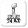
Super Bowl gets a corporate logo
 From 2011 forward, the Super Bowl will have its own corporate logo, which will live on from year to year, and an event-specific logo, a modified version of the corporate mark that is specific to each year's event number and location.
 Apparently, the NFL wanted to create a more consistent image-albeit cold, phallic and slightly Battlestar-like one-as well as to forego the annual review process wherein various professional design firms had a shot at the goal. The design firm Attik will hold the honor of having created the last logo of that ilk for the 2010 event.
Playoff trophies and logos will also be affected by the changes. The NFL didn't present the new logo to North Texas officials until last week and sought no input from the host city. Within one hour of the design's release, bloggers and web sites were already rife with commentary.
sports.espn.go.com
(See a complete history of Super Bowl logos at www.sportslogos.net.)
Update: Landor is credited with creating new Super Bowl logo - www.landor.com
Noteworthy ...

 Logo shorts...
 Sixty native organizations in British Columbia have finally agreed on a way to designate goods and businesses as culturally authentic, each of which will be marked with a new logo.
www.theglobeandmail.com
A handy resource for those of you who design logos for sports teams.
sportdrawn.com
London has brand-new new plaid!
londonist.com
2010 City of London Festival logo revealed.
www.designweek.co.uk
Allentown, Pa., has a new logo.
www.mcall.com
Armani Exchange receives complaints about eagle T-shirts
 After being notified that a T-shirt design being sold on its web site offended Indonesians, Armani Exchange withdrew the design and issued an apologized in a statement to Reuters.
Eagles are often used in A/E shirt designs, but this particular bird bore a striking resemblence to the patented national symbol of Indonesia, the Garuda Pancasila.
www.reuters.com
South Butt vs. North Face
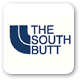 South Butt, a brand parody of North Face born in 2007, was taken to court this week for trademark infringement.
While South Butt stresses that it in no way wants to be confused with North Face, the two companies sell very similar clothing. And there's a certain similarity between the logos that's hard to miss.
The disclaimer on the SB site reads: "We are not in any fashion related to nor do we want to be confused with The North Face Apparel Corp. or its products sold under "The North Face" brand. If you are unable to discern the difference between a face and a butt, we encourage you to buy North Face products."
Cheeky. Here's hoping the court is as amused.
www.themaneater.com | www.thesouthbutt.com
State Oil Fund of Azerbaijan presents new logo
 The man's hands are depicted using ornaments from traditional Indian art. The distance between the hands symbolizes the all-seeing eye, and the ball in the hands represents the heart of man.
en.apa.az
London Film Museum gets new identity

 Radim Malinic of www.brandnu.co.uk, an illustrator, designer and art director well known for his bold, bright use of color, shape and photography, has created a multi-faceted identity for the London Film Museum.
It's an identity meant to appeal to film buffs as well as the casual museum passersby or visitor. The suite of elements Malinic includes 435 elements in 14 color schemes with an extra 125 graphic devices. All of the visuals are original. Avoiding stock imagery kept the identity clearly focused on originality and craft.
At present, the identity is being used on banners, posters, flyers, staff uniforms, interior signage, maps and merchandise. It can be viewed at the museum and along the South Bank next to London Eye.
www.digitalartsonline.co.uk
New Apple iPad
 The advent of the iPad brings with it host of business ops for designers, among them creating book covers that pop off of the wood-grained iBookshelf.
Other ideas for new iPad lines of work and creativity:
Team up with programmers to develop an application; iPad ap icons (and redesigning iPhone ap icons for the larger display); iPad cases; interfaces for GPS sensitive social networking applications; applications that utilize the accelerometer; desktop wallpaper; motion design for free ad supported podcasts that play like TV shows; art created uses the application Brushes (and other painting aps) on the iPad; collaborate on design projects via WIFIl; and share design inspiration via WIFI.
Ford through the years
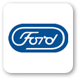 In 1966, Paul Rand designed a new logo for the Ford Motor Company at the behest of Henry Ford II, grandson of the famous company founder. But even the mighty have their bad days: Rand's revise of the original Spencerian script logo was turned down by Ford as too radical.
Over the years, Ford used a number of different logos and identity elements. It wasn't until 1976 that the script name/football lockup was used again consistently. In 2003, the logo was revised yet again into the more rounded, shadowed design we're familiar with today.
A note on the true value of an established logo and identity: The now familiar oval Ford logo was used in 2006 as collateral to secure a multi-million dollar line of credit.
wheels.blogs.nytimes.com
Starbucks sister store

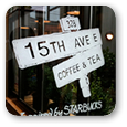 European. Quieter. More about the coffee. That's how customers have described 15th Ave Coffee and Tea, a Starbucks sister store that's exploring what the original brand might be.
Ironically, it's modeled to look just like the humble neighborhood cafes it very well may put out of business. Of course, there's a sense of a Disney facade in the decor, but there's no denying the advantages of being able to explore new concepts for an existing, living and moving brand without damaging it or scaring away loyal customers.
A fact sheet from the Starbucks' website describes the new stores this way: "It shares Starbucks mission and values, is pioneered by Starbucks partners, and offers Starbucks whole bean coffee and Tazo full-leaf tea, delivering the same high quality with the same heart, but in a new way."
www.cnn.com
Hadopi's "errof of manipulation"
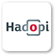 A French agency charged with preventing online pirating is now charged with pirating unlicensed fonts in its own logo. "Bienvenue" was created for use only in France Telecom/Orange products.
The Hadopi agency was created to deal harshly online pirates, but very quickly its officials have found themselves defending what they and the design firm that created it call an "error of manipulation." Hadopi has contacted two design companies and has purchased new fonts with which to recreate the logo.
France Telecom-Orange is so far not pursuing legal action, although the France Telecom employee who originally created the font may.
torrentfreak.com
Visit London identity project

 Wally Olin's Saffron has emerged as the dark horse winner of the much-sought-after Visit London identity project.
Saffron's designs are typographic solutions based on historic London lettering and facts, making it interesting to look at as well as read. The Saffron site features a number of alternate directions as well.
No doubt Dragon Rouge and Studio Conran are standing by puzzled, as both agencies were seen as the true finalists.
saffron-consultants.com
Yummy ...
 Misunderstood fish seeks new identity, logo, possible fine dining.
How do you get rid of the invasive Asian carp? Rename it Silverfin, introduce it to a chef, and maybe people will swallow it.
The Louisiana Department of Wildlife and Fisheries is working with a chain of supermarkets and local chefs to give a brand-new and much yummier image to a fish better known for striking boaters and out-competing local species.
"Carp is such a bad name. When you tell people it's carp they're not interested," says one official. "These are a totally different fish. Give it a try."
www.dailycomet.com | www.wlf.louisiana.gov
A play on Playboy

 For a class project, San Francisco-based designer Alex Cornwell was challenged with redesigning a brand that is dead, dying or defunct. He chose Playboy.
"Playboy has certainly lost something along the way," he writes at ISO50.com. "I saw an opportunity to bring back some of the original classiness and sophistication with a drastic repositioning."
The concept behind his redesign plays on a phrase long associated with Playboy magazine: "I only read it for the articles." In fact, that's all that readers of Cornwell's redesign can do: His version would have no nudity. It's an idea not so far-fetched, considering that at one time the publication featured the best writers and pertinent topics.
Cornwell's explorations are smart and funny. They actually present a path by which Playboy could actually be brought back from the trash heap of skin rags so readily available on paper and on line.
www.alexcornell.com
Noteworthy ...
 Bausch + Lomb offers glimpse of new logo.
Landor creates identity for Kumho Group.
landor.com
Another crack at the recently revised Philadelphia logo.
technicallyphilly.com
New Blu-ray 3D logo shown.
hd.engadget.com
Noteworthy ...
 Lacoste works to save the crocodile-literally.
Expedia launches Fed Ex-like logo.
seattletimes.nwsource.com
Good-bye I.D.
www.mediabistro.com
A quick walk down memory lane.
www.mediaite.com
Google redesign starts to gel.
news.softpedia.com