At LogoLounge.com we look at A LOT of logos and see plenty of trends: Some are aesthetic, some conceptual, and some cultural. As the internet's largest database of over 50,000 logos to date, you can't help notice the evolution of design and trends.
For instance, we have seen many more 3-D logos that are designed to be in motion, never still or flat. These designs have completely shaken the earthly bonds of CMYK and exist only in ethereal RGB: The old logo design rules just don't apply to them.
Another development: Today, for many trends there is now a countertrend and this is not only the case for logo design. The public and its likes and dislikes have become fragmented across the spectrum. Companies who need logos and designer who create logos are forced to respond accordingly. It has become increasingly difficult to simply look in one direction or the other.
It is also becoming disturbingly clear that logo design has become a public sport. As the public controls their own media more and more-Tivo-ing this, blogging that, YouTube-ing and Googling everything else-people are no longer satisfied to simply consume what is placed before them: They have opinions they want to share. So when a large corporation reveals its new identity, there are hundreds of internet sites flinging their opinions back at it. Even when the village board of Remote votes on a new logo for its two police cars, citizens take to the streets waving pitchforks and copies of their own designs. Committeecide seems to be rampant.
The full 2007 trend report follows. Whether we are noting social, conceptual or aesthetic trends, remember that none of them exist in a vacuum or in a single moment in time. They are results of many trends before them and are developing taproots as we speak.
Also, you will note some amount of aesthetic crossover between trends. For instance, the Dos Helix and Ribbon trends do show similarities. But with these categories and all others, we are more interested in the difference between their fundamental concepts. Our observations are just that-observations. They are not recommendations. Finally, they are presented in no particular order.
01 | Logo Trend
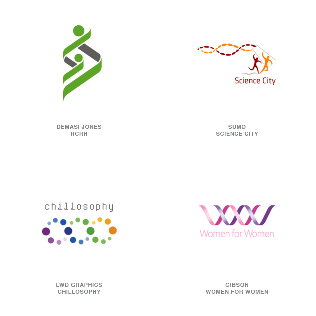
Dos Helix
Deoxyribonucleic acid really sounds like the last thing that could influence design until you knock it down to the initials DNA. It's the root of life and the code responsible for the past and the future of any living entity. The double helix strand has now transcended the field of science and, over the last generation, moved comfortably into the field of pop culture.
Hollywood has turned DNA into the glow-in-the-dark plot twist of CSI "insert city here". The design community has latched onto the twisting double helix structure as the public now sees this shape as a spark of life or the signature of an individual. Representing the genus or the seed of life, health and longevity, a family tree, a code, a mystery, or an unbroken sequence, these strands have a certain symbolic power that can be agreed upon by science or religion alike.
02 | Logo Trend
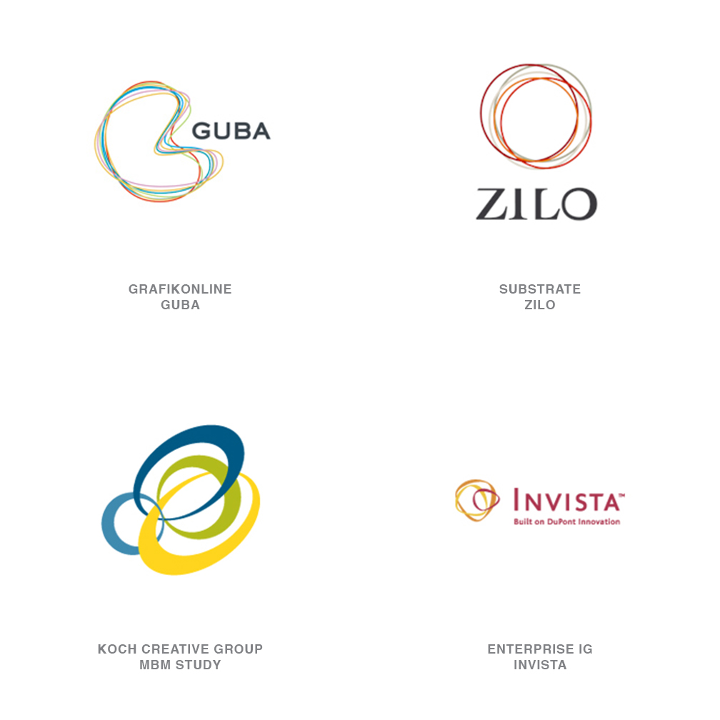
Rubber Bands
"The rings of innovation" designed by Enterprise IG. It's easy to imagine the global aspect of the company and the interlinking products and efforts with the bisecting fiber like rings. (though to the public or an untrained eye, this may well look like a random assembly of rubber bands in your top desk drawer).
This is a trend that connects directly to directions from previous years-Natural Spirals and Cave Rings, specifically. This is chaos and geometry coming together.
These linking rings tend to express the concept of a collective of product, employees, companies, or divisions that work together as a larger whole. They may appear to have varying degrees of autonomy or flexibility based on the tightness or shape of their configurations. Color is generally the marker that defines individuality, but it also helps us grasp the concept of the whole being greater than the sum of the parts.
03 | Logo Trend
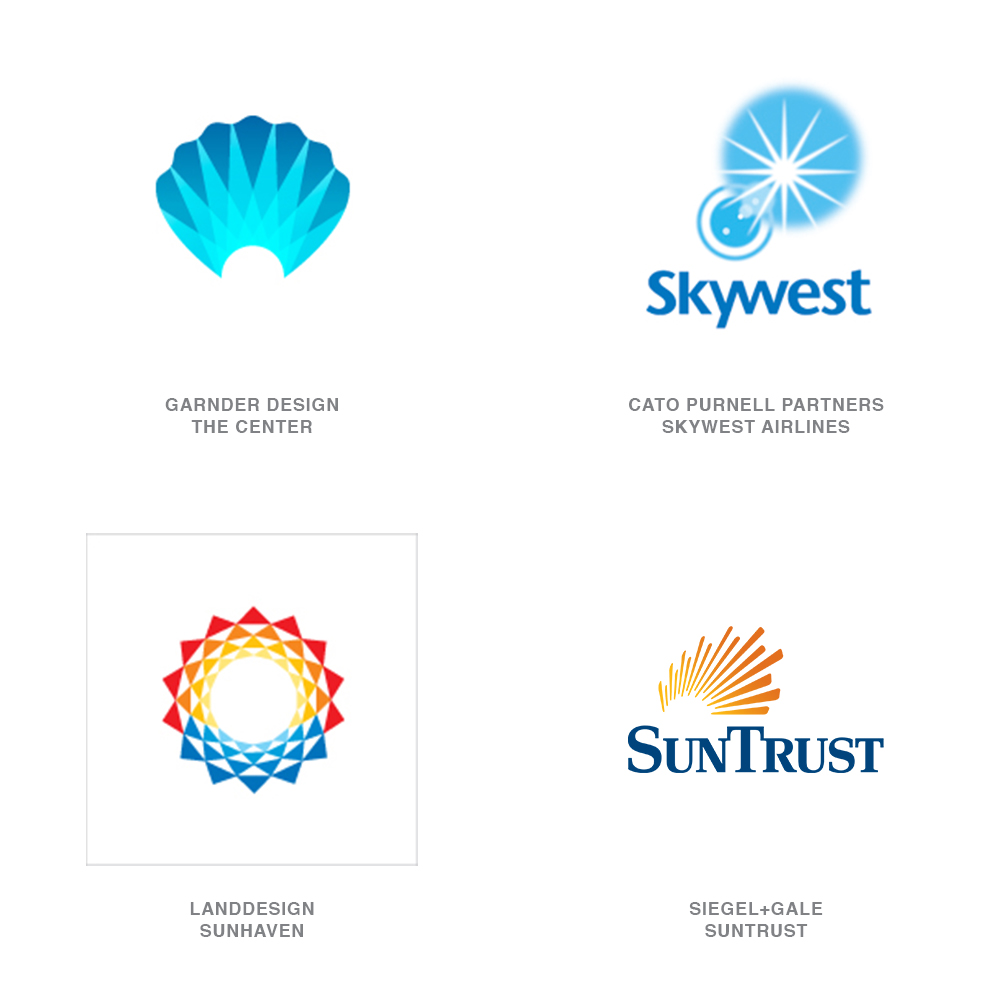
Radiance
These marks have a certain warmth that conveys comfort not to dissimilar from the light at the end of the tunnel. This glow may become more prevalent as we try to convey optimism, purity, warmth or escape. But the fallback position for this much wattage is still a guiding light or source of knowledge.
04 | Logo Trend
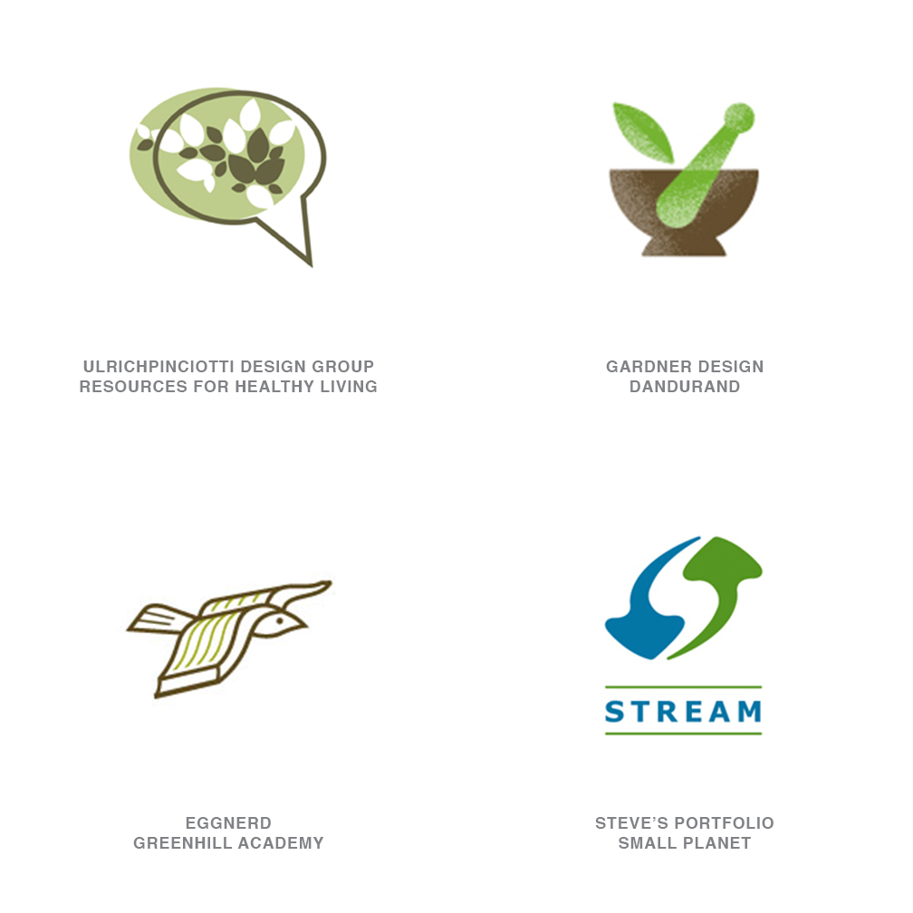
Eco Smart
The loudest drum for the corporate world to stay in step with continues to be sustainability. In one form or another, our ecological welfare has been the crux of a trend in every report LogoLounge has released. The fact that we are still reporting its influence is not an agenda but is testament to the sustainability of sustainability.
These Eco Smart identities are simply getting smarter. Trees and leaves are still there, but the application has taken a more intelligent approach. It could be that some prior adopters of green identities were merely giving lip service to the cause. It's not just about adopting the color green. These logos are blended with an application and an ethos, more sensitive to the environment. The marks have grown up and seem to be telling stories with a softer voice, not with a piercing shrill.
05 | Logo Trend
Lit
Over the last several years, we've seen logos crystal capped, light pinged, and puffed up like a silicone implant. The concept is simple: Create a degree of reality that allows an image to lift off of the page. This dimensionality lets the logo play on a different field than the world of flat one- and two-tone marks. Not subtle, but effective.
Now enters subtlety via the well-lit logo. Actors have been told for ions to step into the lights, and now logos are doing the same. It's little more than intelligent stage craft. These logos are not necessarily dimensional; in fact, most are relatively unassuming. The primary difference is the illusion of good lighting. It's an understated effect that pays off well in capturing the consumer's eye.
06 | Logo Trend
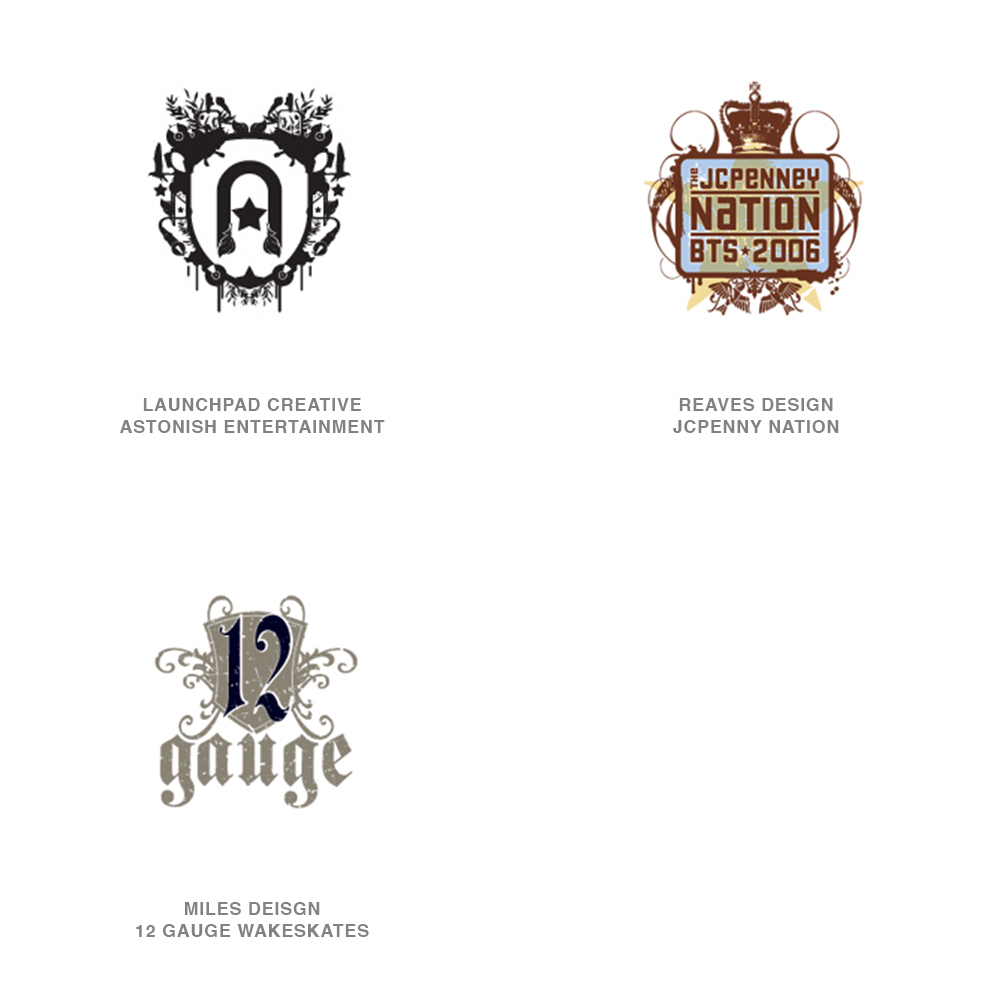
Pseudo Crest
Mix a little nose-in-the-air, overly stodgy, family coat of arms with a sharp tongue-in-the-cheek, Napoleon Dynamite liger, and you have something that approximates a Pseudo Crest. These are fun, and packed with detail that sticks it to the man at every opportunity. For the high school and college market, Jason Schulte's firm, Office, built a best-of-class brand for Target with the Independent Studies line.
At first glance, most of these look like they've been lifted from a heraldry 101 style book, until you scrutinize the composition elements. Only at this point are you likely to see wrenches, guitars, penguins, shoes, cell phones and anything else you'd never expect to find in Camelot. This is a youth anthem; and designers have identified this as a source language for fashion culture and the music industry. In fact, this is a modern trend you will see everywhere, despite its roots in heraldry and even other intricate patterning like Victorian wallpaper.
07 | Logo Trend
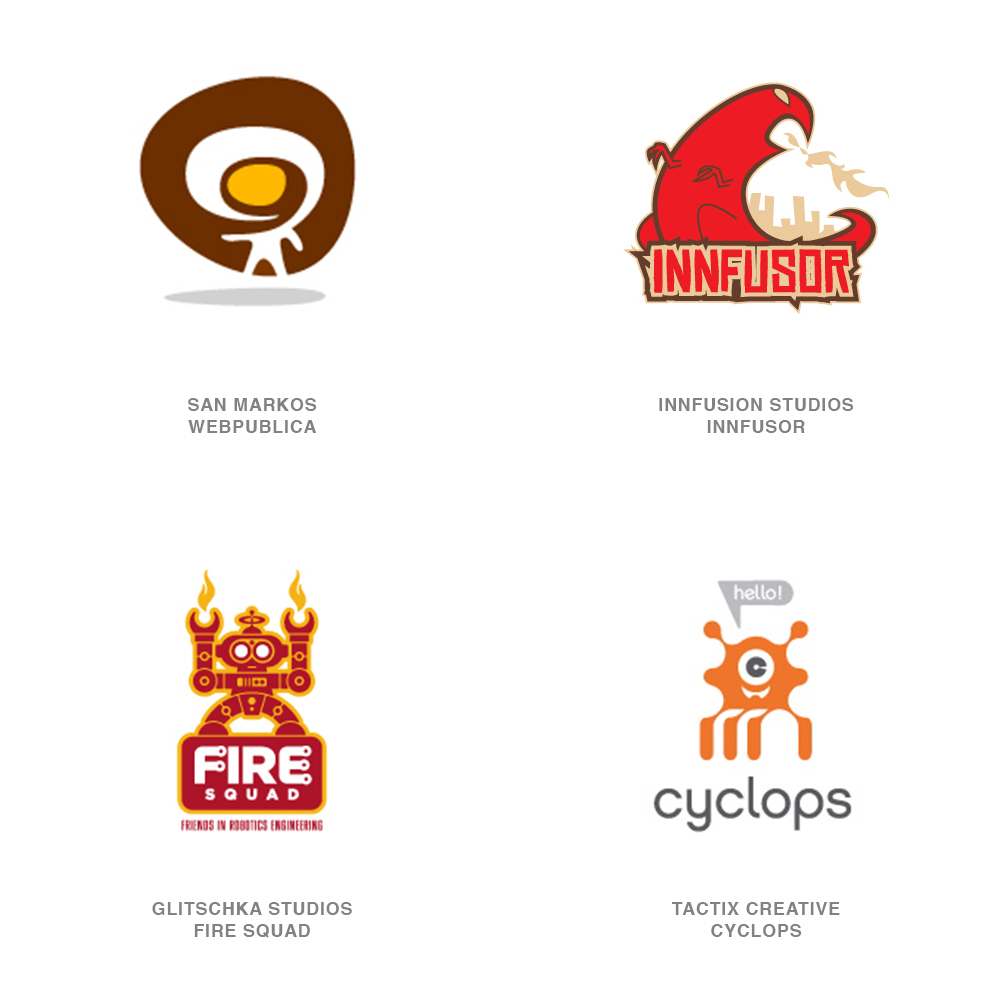
Urban Vinyl
First made popular in Hong Kong by Michael Lau in the 90's, these imaginative imps have become highly collectable and have entire stores, KidRobot and magazines, Super 7, dedicated to their notoriety. The art of Tim Biskup may start on canvas but it soon translates to designer vinyl characters. Usually they can be as mundane as fire breathers to as outlandish as slimy cyclops ghost aliens. Though not a serious influence on Fortune 500 identities, urban vinyl has its place in pop culture, and that has translated to two-dimensional applications in logo design.
08 | Logo Trend
Hubs
These logos could serve as the model of a communication structure for any online community. There is a central hub that serves as the dissemination point for information. Without the hub, the satellites lose their ability to make contact with the other members of the group. So whether these logos are for a communication tool or not, the distribution from a central point is usually key to the concept. The other aspect of this technique is many elements coming together for a greater common good. As prolific a theme as this has become, designers continue to build unique visual concepts.
09 | Logo Trend
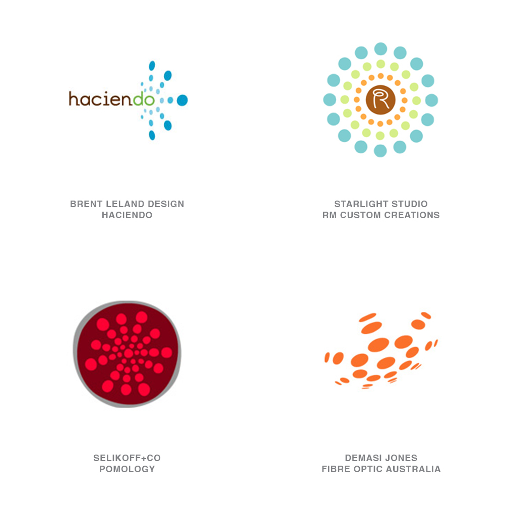
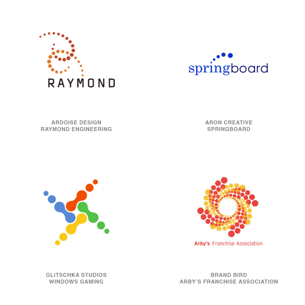
Descending Dots
Once you've started looking for this concept, you will see it everywhere-including in other categories within this report. With very few exceptions, these logos are made out of a series of dots either ascending or descending in scale consecutively. Most of these logos depict motion to help advance their message. Imagine using this language as a shorthand for static animation. It's basically the Eadweard Muybridge stop-motion freeze-frames-turned-logo, except each earlier frame is a bit dimmer or smaller than the next.
As we feel more compelled to explain motion-related concepts in a unique fashion, we will discover new visual language that will help us achieve this. In previous reports, we discussed the use of less traditional techniques to define motion, including, Blur, Dot Fuzz, and Blow out. Descending Dots rely on vector edge graphics to achieve their effect, much as Robert Miles Runyon used stripes to help define his Stars in Motion for the 1984 Los Angeles Olympics. The fallout of this era was a decade or more of logos that, by virtue of their sweeping stripes, all declared loudly, "I am moving."
10 | Logo Trend
Flora
A number of designers have been responsible for this tracery-like visual language, but the pioneering work of the Netherlands's Tord Boontje has probably gained the greatest notoriety. Tord was responsible for the delicate, and intricately diecut POP materials used for the 2006 Holiday presentation at Target. This layering of highly embellished organic lace has influenced identity design, especially in retail application.
11 | Logo Trend
Half
An optimistic outlook will assure us these logos are half full. Engaging the public to participate with the identity has always been a strong method of building a tie to a logo. That "aha!" moment, when clever information assimilates and comes into focus, is the moment we take ownership in an entity. The secret here is not to bury the punch line so deeply that the consumer never gets to it. Here, the missing half of a visual element tells the story.
Where is the other half and why has it been chopped off, is it just over the edge, or is it submerging, or emerging? Simple word play or, in some events, image play allows the consumer to associate the product with an action. Cutting off part of an image can in some cases become confrontational, however, and cutting a perfectly good number or letter in half is tantamount to heresy in some cases. Letters are sacred to consumers: Altering them is one thing, but removing their better half makes people look.
12 | Logo Trend
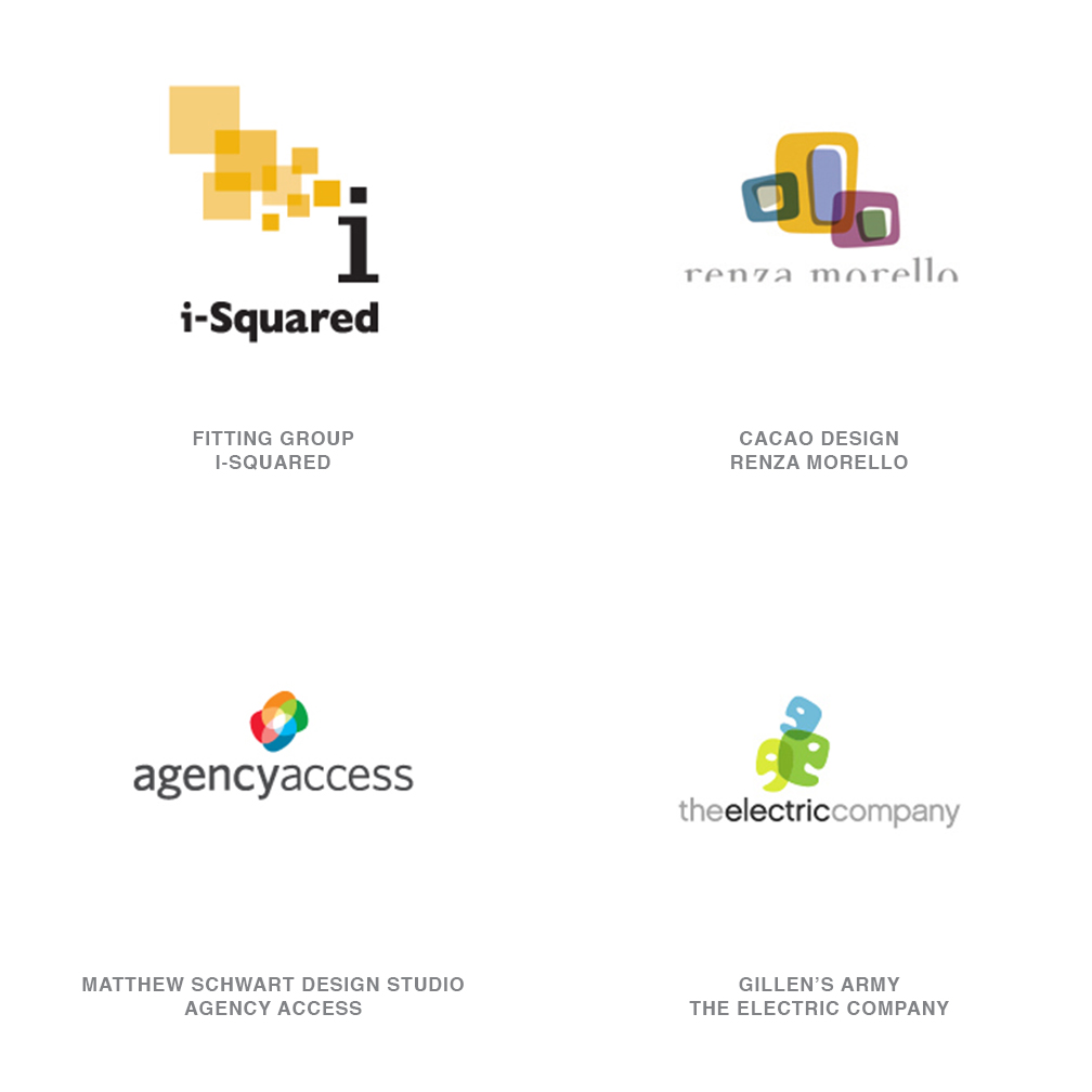
Overlap
In some respects, this is an evolution of last yearís Overlay trend and a definite continuation of the strong transparency genre in logo design. While still relying on relatively flat color overlay-like so many layers of colored lighting gels-this direction is more concerned with linkage. These logos describe sets and subsets as an analogy for the literal connections within a corporation. Remember that transparency is a strong buzzword in the corporate world: The need to be fiscally and otherwise transparent to the public, employees, and investors is an essential trait.
Elements coming together with nothing to hide help to extol the depth or diversity of an institution. The overlapping subsets can often be used to help tell a story or explain the architectural structure of the organization. Advances in software have made the process of designing transparent imagery much more inviting. Adobe Illustrator, for example, allows a designer to experiment and see transparent techniques in real time as opposed to the arduous steps that Photoshop would require to achieve the same result.
13 | Logo Trend
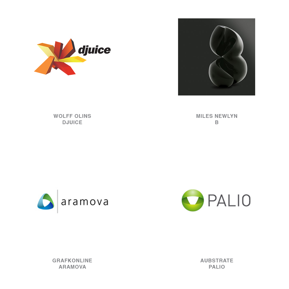
3D
For years, logos have been taking on more dimensional characteristics as they have become puffier, reflective, or glassine. But in general, these are more of an affected surface treatment, as opposed to an all-out "Here's what my backside looks like." As soon as a logo takes on full three-dimensional qualities, unanticipated questions start to arise. If I spin the logo a quarter turn, is it still my logo? If I zoom in on it from an angle that obscures, is it still my logo? If I turn the lights down on it, is it still my logo? If I go through traditional trademark channels, can I register this dimensional object from any perspective?
Miles Newlyn is the London designer responsible for the proposed B logo for a major telecommunications company. Additionally, he is one of the premiere go-to designers if you need a breakout concept, such as his identities for 3 or ish. Miles attributes one of his inspirations for three-dimensional logos as the Jaguar hood ornament which is immediately recognizable from any angle. The challenge with a true 3-D logo is that a company must have the media resources necessary to convey the identity in its full spectrum of dimension. This is why many of these logos settle for the appearance of great dimensionality from a single perspective, not the real thing.
Miles remains a leader in this emerging direction: He notes that being able to create a 3-D logo is not as important as is knowing which clients need them. But more and more, businesses are requesting them just to be stylish.
14 | Logo Trend
OpticaLine
Who doesn't stop mid-step when confronted by an optical illusion? We just feel compelled to give it a second look and evaluate it. Whether we look at these as a challenge or an amusement, they demand our attention. Optical illusions are generally linear in nature and have an M. C. Escher quality to them that challenge the laws of physics. Or they may seem innocent enough until they rotate on you, or dip into a new perspective on your second glance.
The idea of the possible impossibility is a very attractive concept as designers describe a niche for a client. The clever thinking of the illusion speaks to the "we can do what no other can, because we're smarter that way." Initials delivered through this magical context seem to be a natural application. Because of the dimensional nature of these marks, it is not uncommon to see them in use with architects or products that define an environment through a new perspective.
15 | Logo Trend
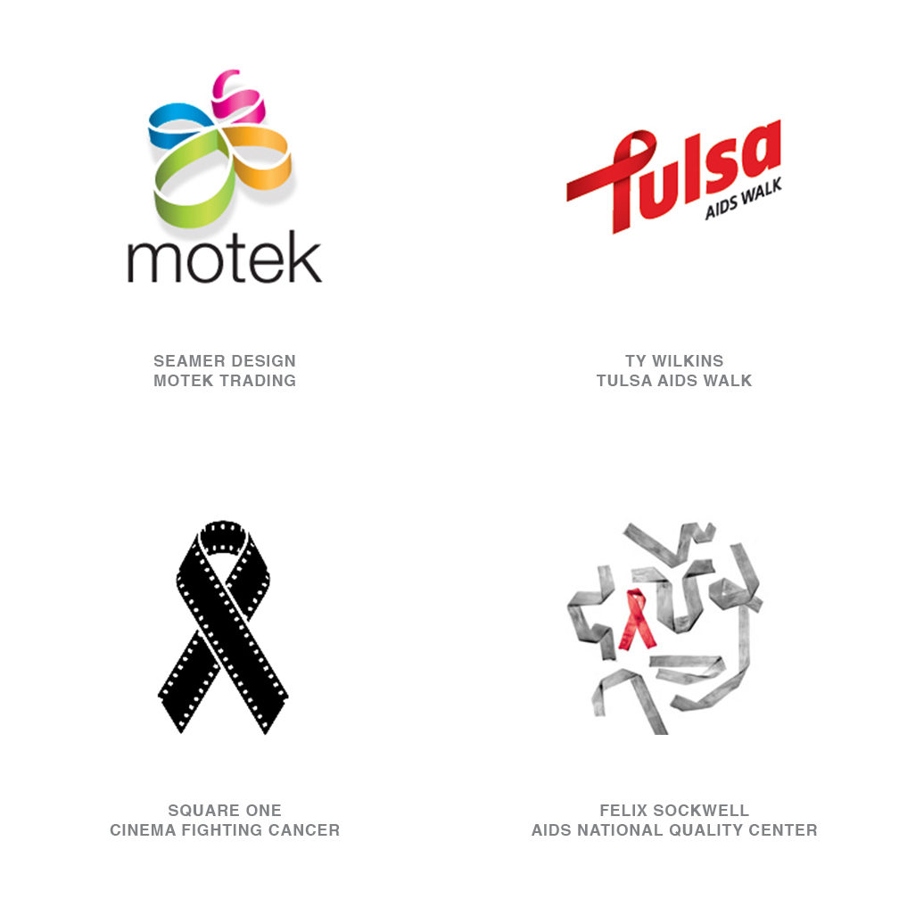
Ribbons
There are surely entire cities in China that owe their existence to the export of magnetic cause ribbons. When did cause ribbon become a punch line? Yes, we want to show we care, but the literal rainbow of causes have become so diluted with this icon that its soul is on the verge of extinction. There is not a lack of concern for these causes as much as a recognition that we have been gorging ourselves at the ribbon trough too long and maybe it's time to purge.
Fortunately, there are designers who have stepped in to offer CPR to this flagging icon. Many of the best logos that base themselves on the ribbon were created at the early end of this trend. There are still novel opportunities and unique application to be found with the ribbons, but they will be fewer and farther between. It will be interesting to see if the sustainability trend crosses paths with this trend. Then we'll figure out a great recycling plan for the ribbons so our landfills aren't knee deep in magnetic rubbish.
1. Seamer Design for Motek Trading 2. Ty Wilkins for Tulsa AIDS Walk 3. Square One for Cinema Fighting Cancer 4. Felix Sockwell for AIDS National Quality Center
Minor Trends
- Animotion: Noted at the start of this article, these logos are designed to be in motion as opposed to logos that are designed flat and then animated.
- Wreaths: Lots of elements, sometimes so delicate that they would not have previously been considered to be part of a logo design, assembled into a patterned whole.
- Rainbows: Possibly growing from the buzzword "inclusiveness,?likely emerging from clients?greater tolerance for brighter colors, but definitely fed by RGB.
- Numbers: Inserting a numeral into a word in place of a letter, ideally to further the meaning of a wordmark. Text messaging and IM-speak is everywhere.
- Holes: Designers are playing with the apparent surface of the paper. Designs appear to disappear into or emerge from sinkholes or cuts.
- Dragons: Lots and lots of dragons.
- Big benday: Hyper close-ups of benday dots. These dots overlap and randomize.
- Cartouches: Look for more and more shapes that are bracketed in one way or another.
Thank you to Marita Wesely-Clough, trends manager, Hallmark, and designer Miles Newlyn for the insights they provided for this article.
Follow the trends.
Logo design in your inbox. Subscribe to our monthly newsletter for the latest from LogoLounge.