When you've spent a month studying 17,000 logos from around the world, your mind can't help but notice certain similarities. Just ask Bill Gardner, who at this writing was putting the final touches on the second book to be released by the web site he founded, LogoLounge.com.
The new book, LogoLounge Book II, will be released in January 2005 by Rockport Publishers (www.rockpub.com). It is a follow-up to LogoLounge Book I, which went into second and third printings soon after it was released in early 2003.
Gardner, whose firm, Gardner Design (Wichita), is well known for its logo and identity work, was organizing 2,000 logos that were selected by this year's LogoLounge judges: Joe Duffy of Duffy Worldwide in Minneapolis, Tom Nynas of RBMM in Dallas, Dana Lytle of Planet Propaganda in Madison, Ken Shadbolt of FutureBrand in Melbourne, Australia, Tony Spaeth of Identity Works in New York City, Rian Hughes of Device in London, England, Marcus Greinke of Enterprise IG in San Fransisco, and R¸diger Goetz of Simon Goetz Design in Germany. The process affords him the ability to see what new trends have developed and which have morphed since last year's LogoLounge trend report.
"We are not suggesting that designers follow any of these. But it's interesting to note where design is going and why," Gardner says.
01 | Logo Trend
Glassine
Many designers have discovered Photoshop's tools that produce a glassine appearance.
Like the recently revised UPS logo, many marks have been crystal-capped. Also like the UPS logo, many of these same marks are updates of older designs, and perhaps the added highlights are intended to infuse new life or present a rehabbed logo in a new way.
These designs do stand out: They have a little extra sparkle or light that was previously seen more in packaging design, either through art effects or foiled papers. Perhaps this trend is an homage to the previous generations highly airbrushed and chromed designs of 20 years ago. Or perhaps it's just the realization on the part of designers that in an RGB environment, where so many logos live today, flat art is just not necessary.
02 | Logo Trend
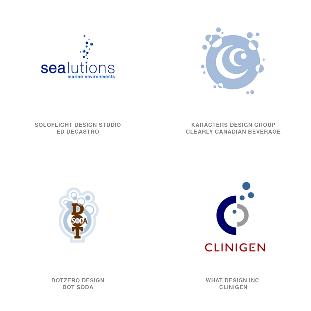
Bubbles
This year marks the first sighting for this trend. What's strange is that bubbles are not always used in designs that might be associated with liquids. It is a new way of representing water and motion, an outgrowth perhaps of previous year's trend of droplets producing ever-outward-moving rings on the water's surface. Bubbles are also still used for their conventional implications of cleanliness and refreshment.
What's interesting to note in designs using bubbles is that they often do not form a logo that has a defined shape, such as a circle or square. They are more organic and likely have the ability to better integrate into many different environments.
03 | Logo Trend
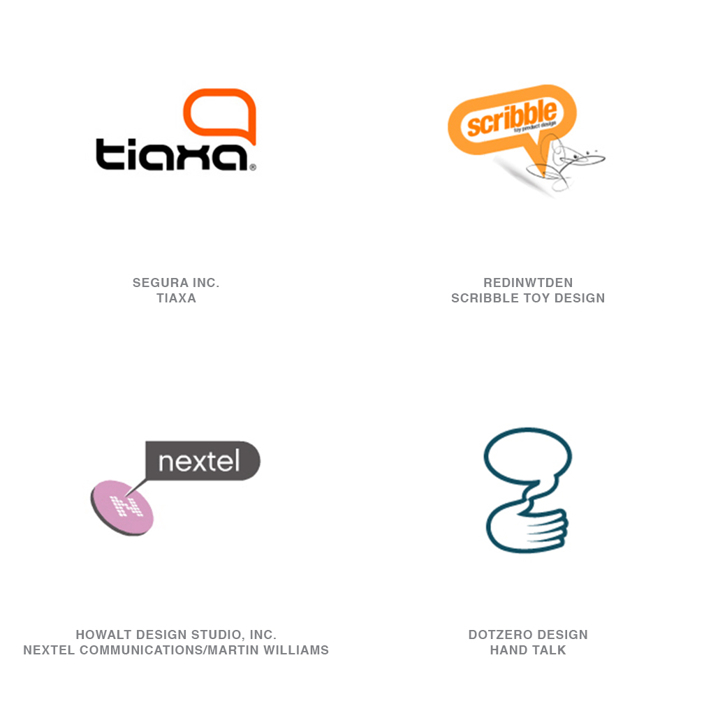
Dialogue Boxes
Dialogue boxes are rampant, and curiously, many times they are empty. Word balloons and thought bubbles are popping up all over, as are designs that are suggestive of help boxes from on-screen environments. These devices seems to suggest communication or the exchange of ideas.
While dialogue boxes are a fresh take on communicating communication-perhaps taking over from the previous and now tired device of the arc swinging from point A to point B that was so prevalent in the past five years-it does appear to be a crutch in some cases. It's as if the client and designer couldn't decide what to say about the company in question, so they abdicate responsibility to the viewer to fill it in.
04 | Logo Trend
Substitutions
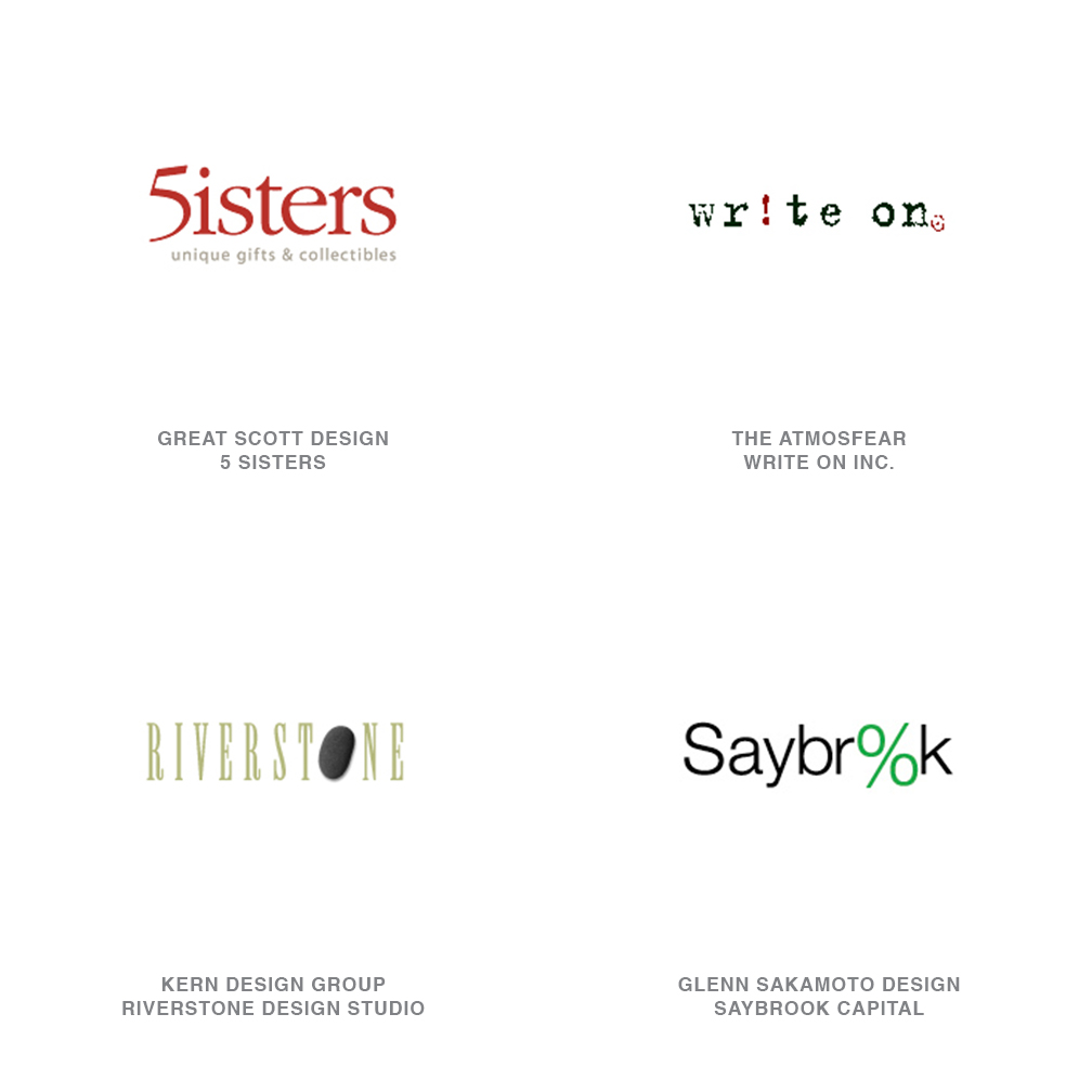
Swapping out a letter from what is essentially a wordmark and replacing it with some other sort of device like a number or art is a tried and true method to create a new logo. It's especially handy for designers who aren't particularly type aficionados but who need a typographic solution. Often the type is as is, right out of the can.
The danger with these is that they can go horribly wrong if not rendered well, particularly with the name of the company that is already somewhat mysterious. Instead of providing the viewer with an "a-ha!" moment, these designs leave him or her with confounding homework and a vague sense of failure.
05 | Logo Trend
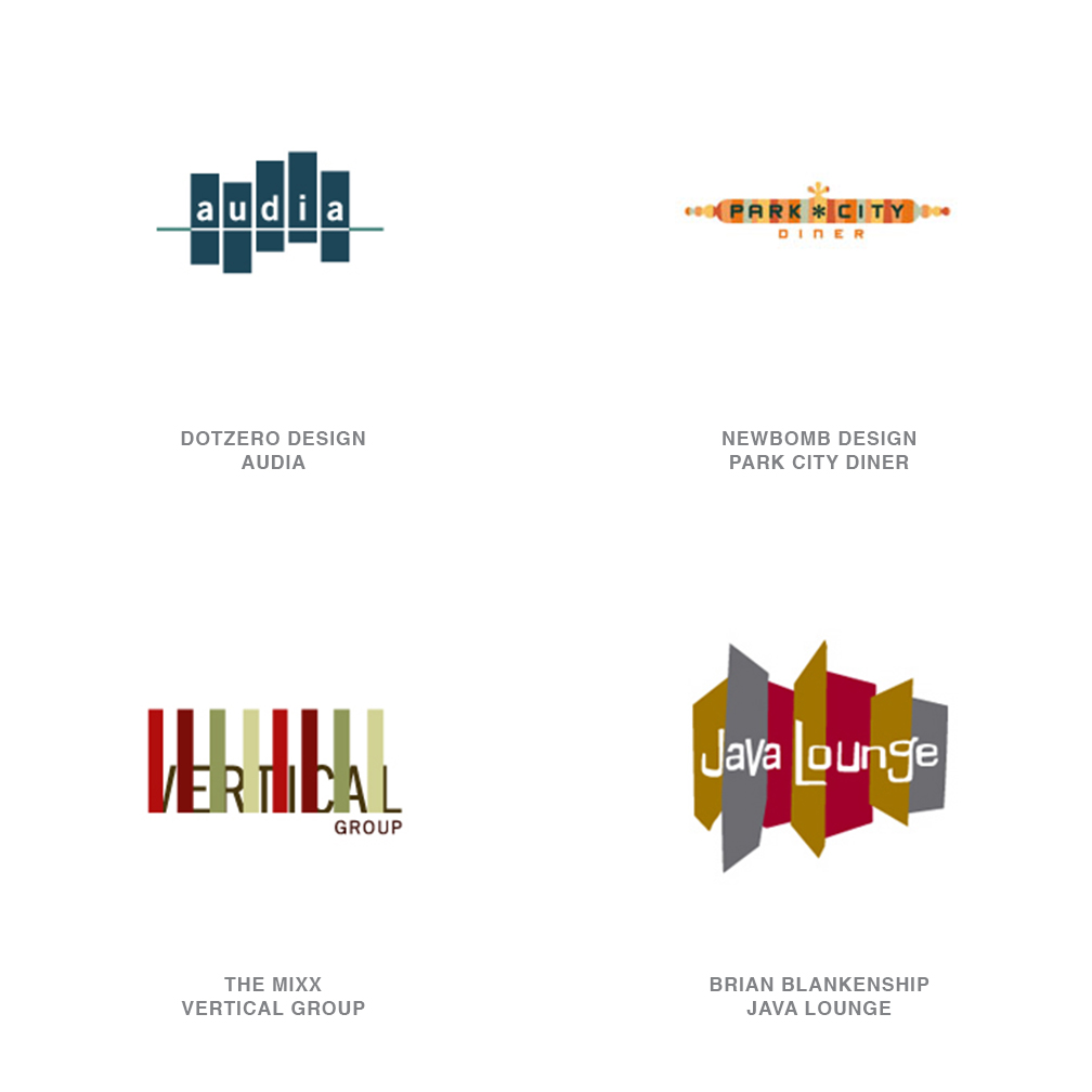
Letter Bars
This is another situation where the type and visual solutions have been merged. The inspiration for these designs could be found in the multi-color striping found in grunge or retro clothing and fashion.
But what is most interesting about the letter bar designs in this year's LogoLounge collection is that they make a complete commitment to color. They completely dispense with the "it has to work in black and white" dictum. Since all primary media outlets now have reliable color available, even newspapers and the Yellow Pages, perhaps this isn't a drastic commitment.
06 | Logo Trend
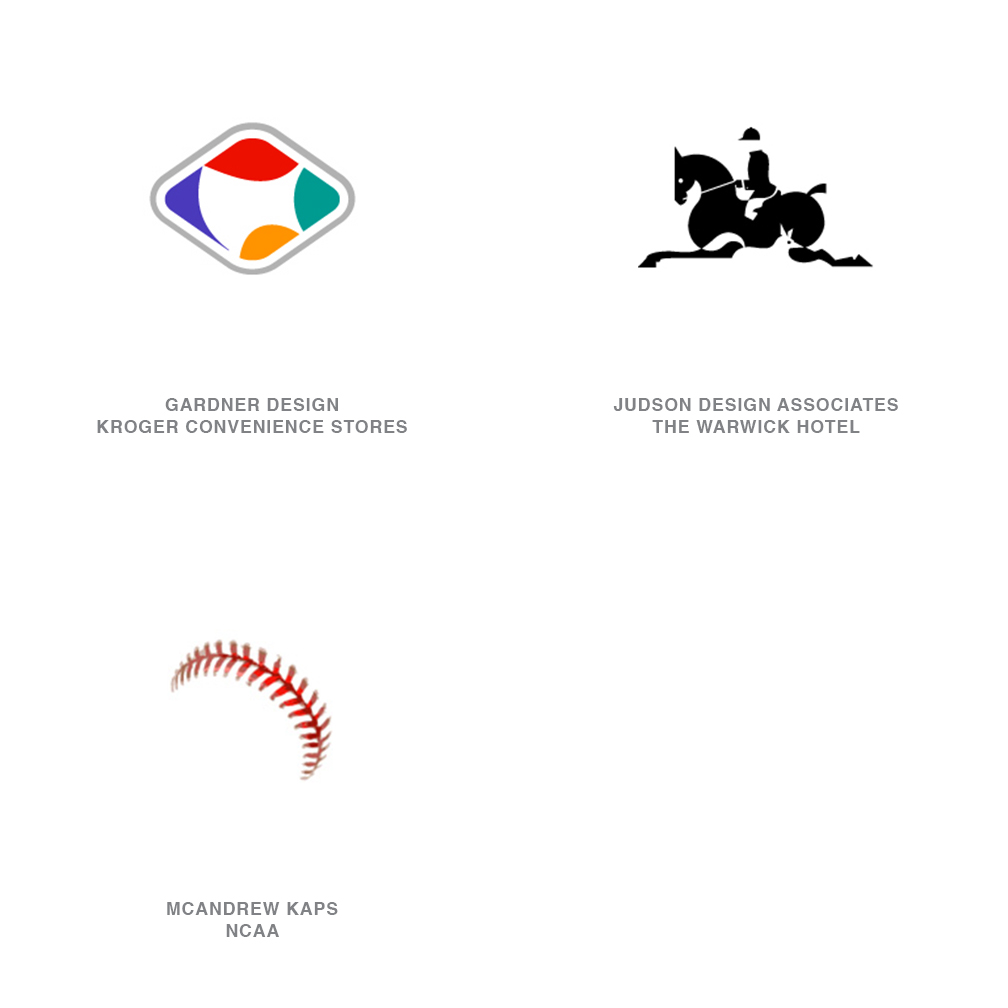
Implied
The idea of giving the viewer the ability to become involved with a design is not new, and the iterations on the theory seem to be endless. It's the art of not showing. It's exciting to know that clients and their customers are becoming so visually sophisticated that they can appreciate these designs.
Even when not done particularly well, these elicit response from the viewer. But most of these designs work just fine as a logo even if the viewer does not understand it, and therein lies the secret of their continued success. The "a-ha!" moment is gravy.
07 | Logo Trend
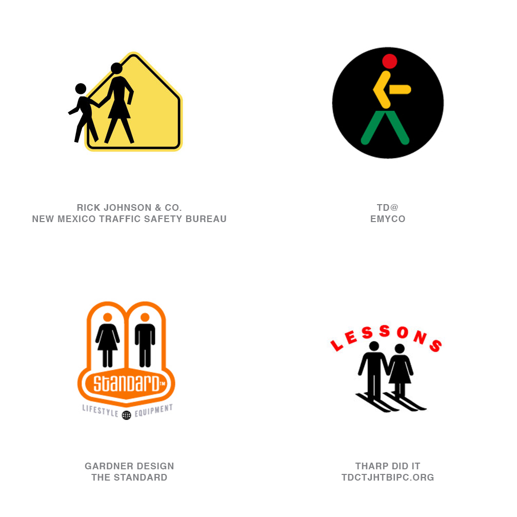
Universal People
There are more universal people out there than ever before, and they're doing everything except what they are supposed to be doing, which is guarding the restroom doors or showing kids where to cross the street. The ability to take a meaningless, ubiquitous symbol and give it personality and even hobbies is somewhat naughty, and younger audiences especially love it.
These designs often speak well to younger generations who are looking for ways to cause a bit of chaos and even be sacrireligious, if possible.
08 | Logo Trend
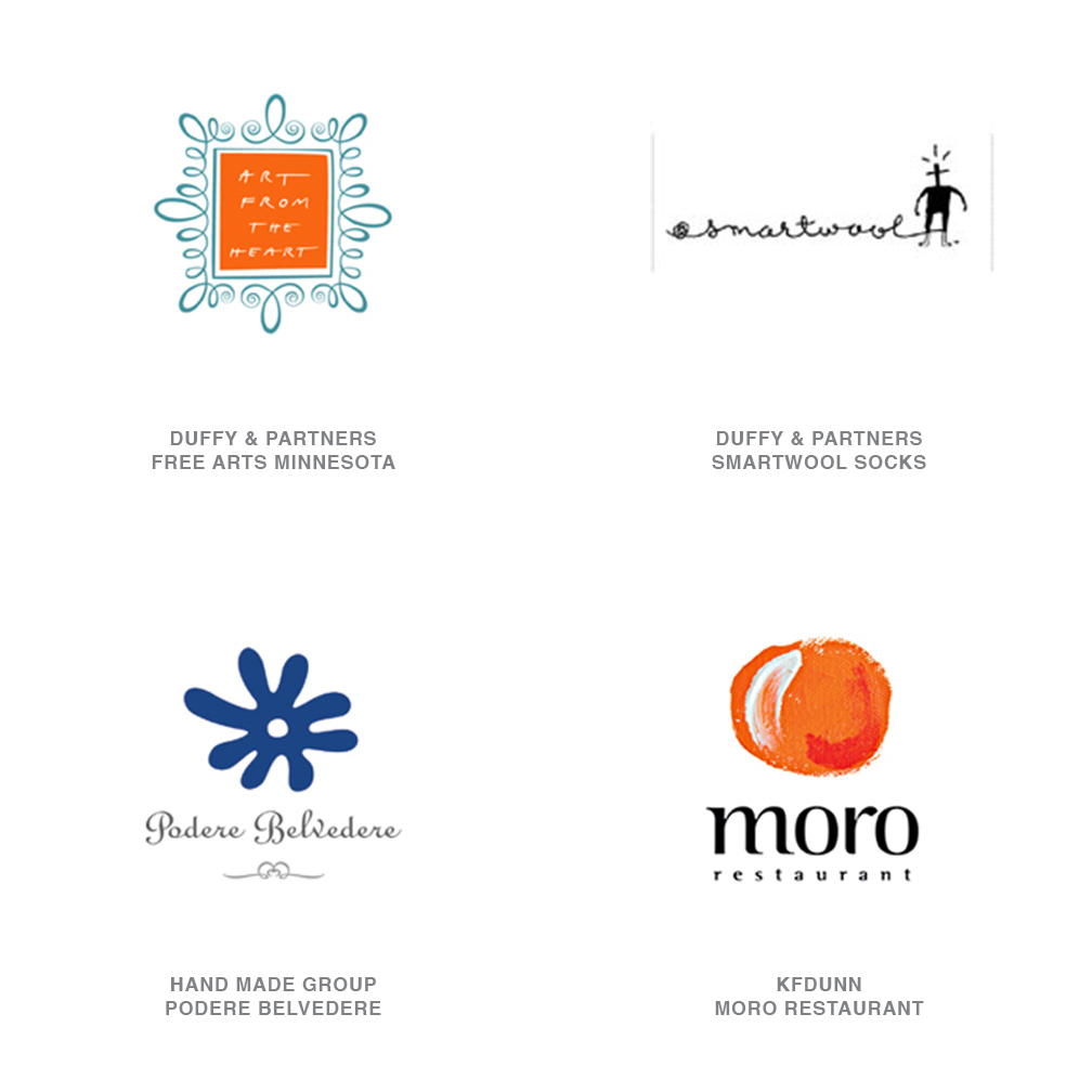
Handmade
This trend is an antithesis to computer-rendered design, even though some of them are electronically rendered. With these designs, it is not important to be symmetrical or use straight lines. Even so, these are often strong identities that speak of the human touch and of nurturing, both of which are attributes many corporations would like to suggest to their customers.
It's interesting to see this revival of a Bauhaus-like movement of hand involvement in design. Clients are discovering that they can be respected entities and still have a logo that is not hard and corporate.
09 | Logo Trend
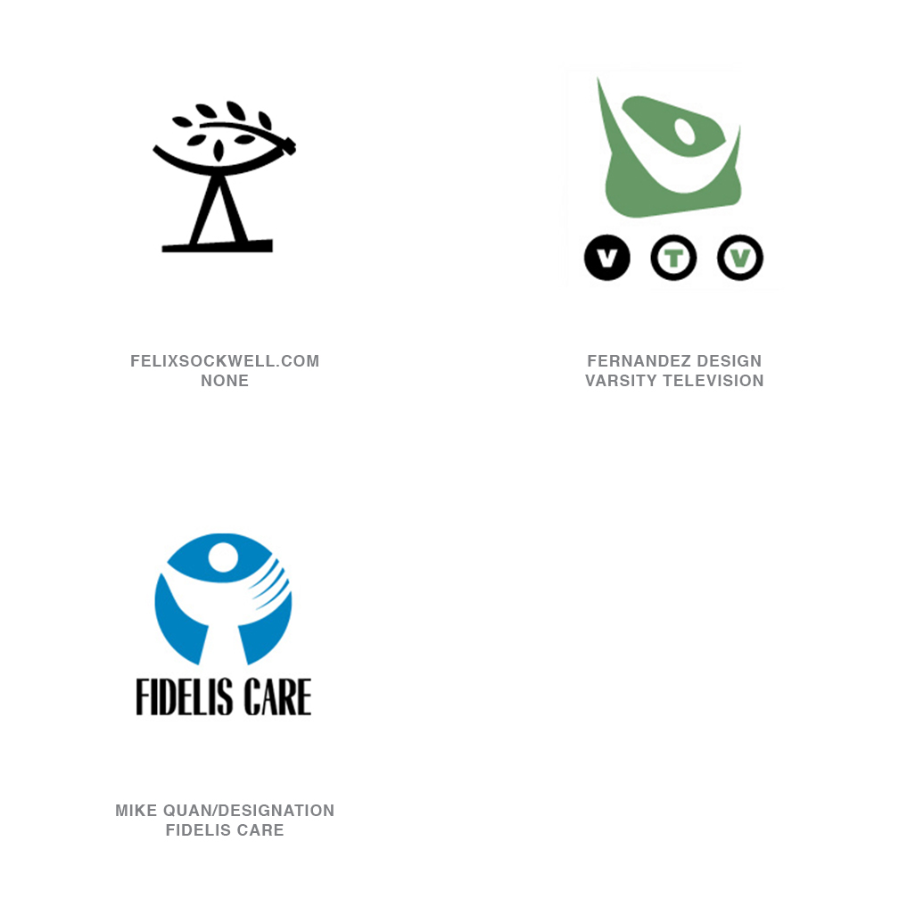
Arm Sight
There are many designs that show a person, usually of indeterminate gender or age, throwing his/her arms up and thereby increasing his/her sight/vision/understanding. This type of design is often used where the client wants to suggest the human touch, but with supernatural powers of wisdom and vision involved. Some designs also seem to suggest praise or a sense of inclusiveness.
All of these designs are very different stylistically, but all are essentially identical. This is a trend that is also revealing itself in imagery in advertising and even packaging.
10 | Logo Trend
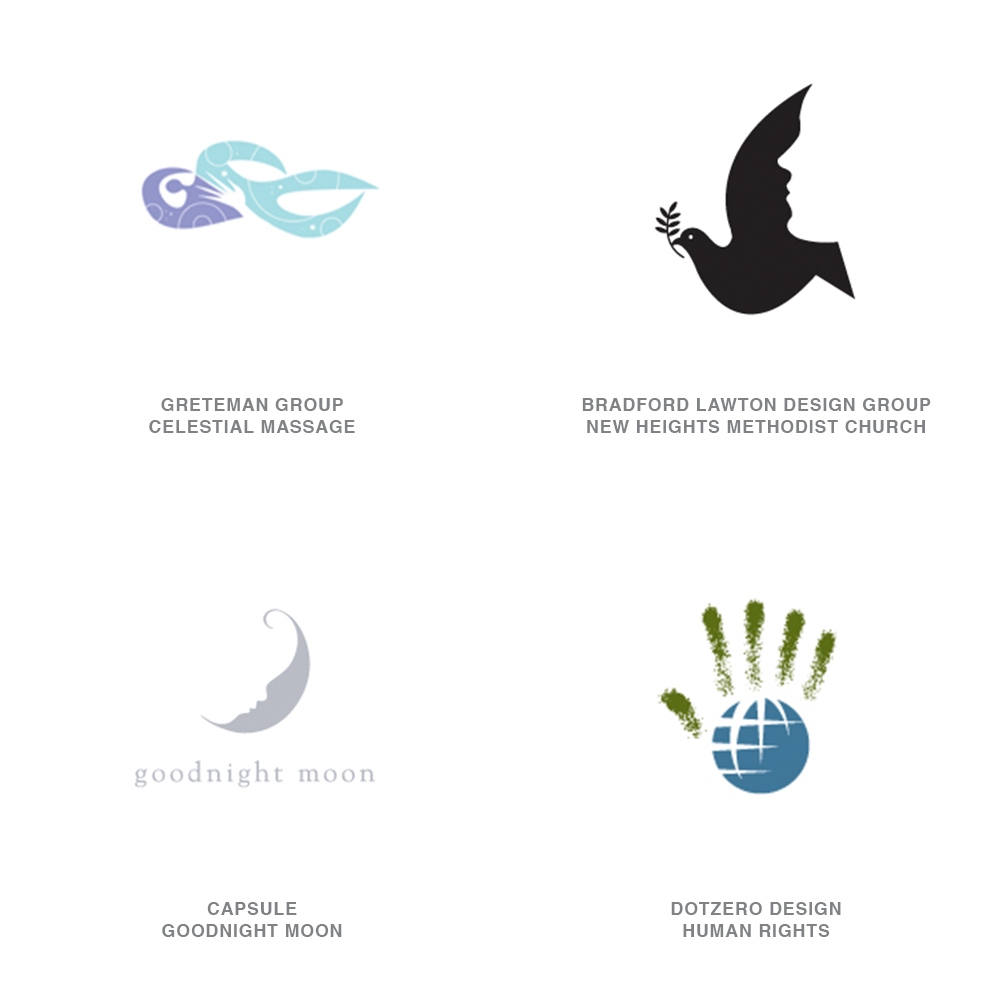
Human Nature
This is an offshoot from Green, one of last year's trends. Large corporations are taking ownership of the color in order to suggest that they embrace human concerns and the environment
In this year's iterations, animals and natural objects are personified, or human features morph into more organic objects. Hands turn into trees, birds (especially doves) turn into people. It all reflects a renewed interest in the environment, but this technique also softens down the human element: As "stranger danger" fears become more pervasive, companies will have to work harder and harder to reassure their customers that they are the good guys.
11 | Logo Trend
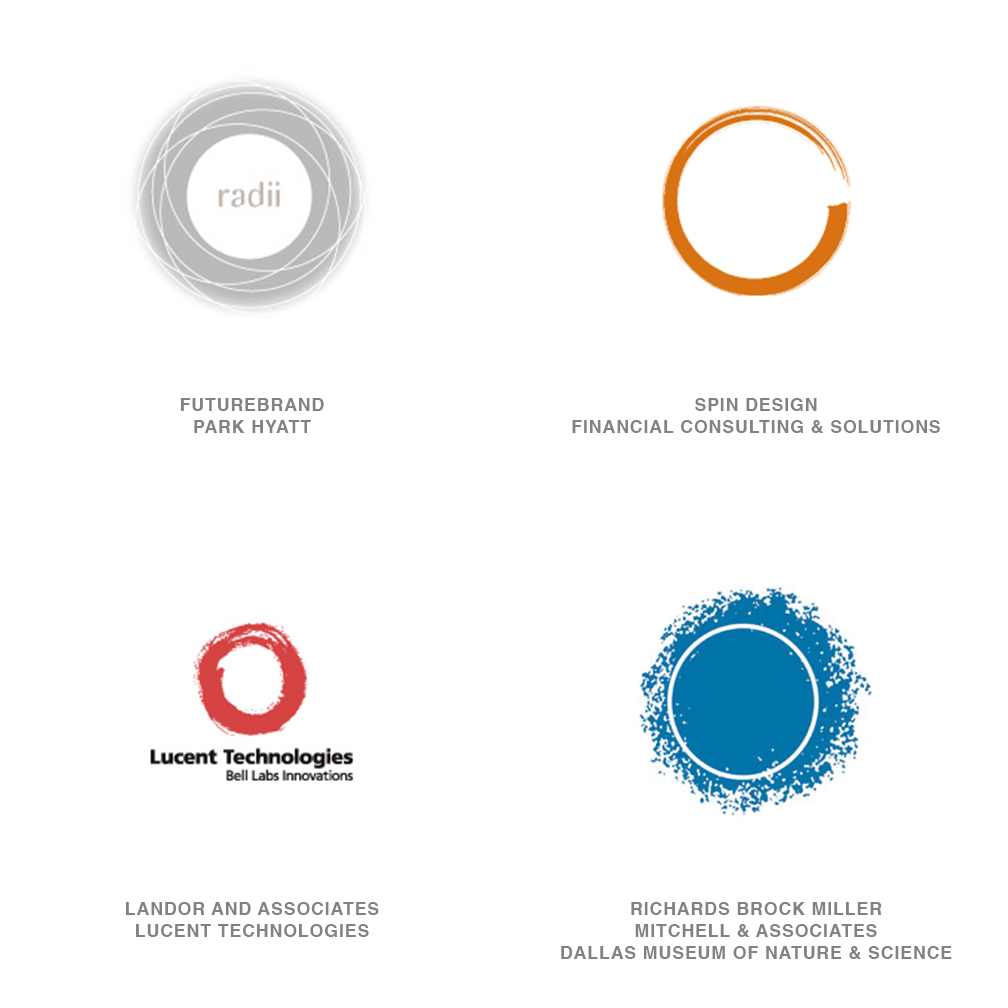
Cave Rings
This is an outgrowth of last year's Natural Spirals trend, even though Lucent Technologies has been around a few years now. These designs show controlled chaos, of taking charge of natural and sometimes unpredictable processes. They reveal a human touch applied to computer processes.
This is perhaps a natural recoil from over-exact processes, but their similitude could grow a bit tiresome: A circle is a circle, after all.
12 | Logo Trend
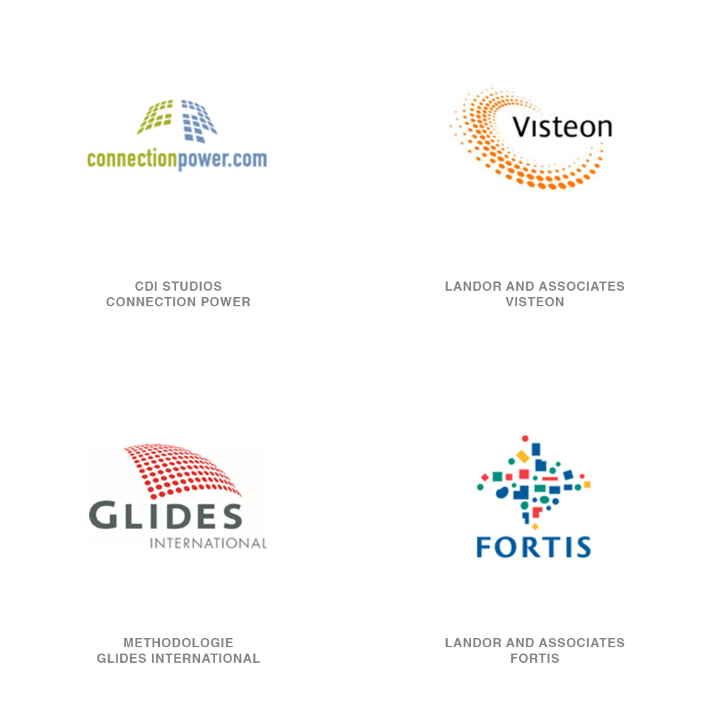
Particle Fields
There is an inordinate number of logos out there that contain a grid of dots or shapes. This is an effect that is easily accomplished with the computer, and it lends old favorites like circles and squares an entirely new wardrobe. Usually, the treatment affords a three-dimensional effect to the shape.
Many times, the particles are used to suggest bits of information or chaos being brought to order by the company. Strength is in the components being assembled. Or the particles have organized and taken on a fluid motion symbolizing direction of movement.
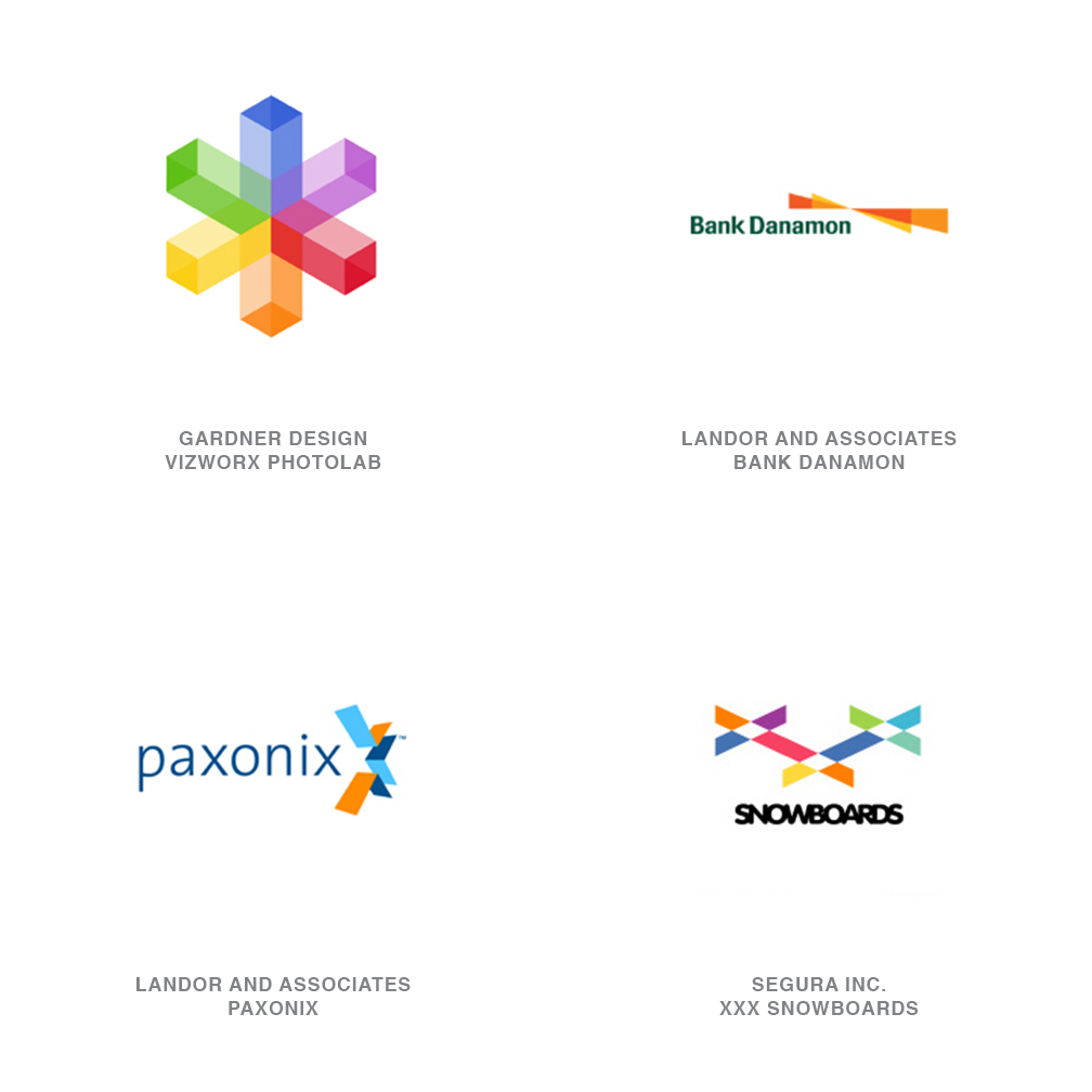
13 | Logo Trend
Prism
This is a variation of Transparency, a trend that emerged last year: The MSN butterfly is an excellent example. The concept of a prism could suggest that people are feeling more liberal with their views. Larger corporations, especially, are adopting a policy of greater and greater translucency in their operations, not necessarily because they want to, but because the public demands it.
This is a relatively geometric solution that takes advantage of advances in color printing and reproduction. These designs have hard lines, but their palette is brilliant and playful, a definite move away from the desaturated palettes we have become accustomed to over the past decade.
14 | Logo Trend
Mezzotint
Although one might assume this is purely an offshoot of a computer function, many of these designs appear to hand-rendered-even created by making a rubbing off of a textured surface. There is a definite move toward hand-craftedness, away from highly polished, strong edges to something that is corporate but human.
15 | Logo Trend
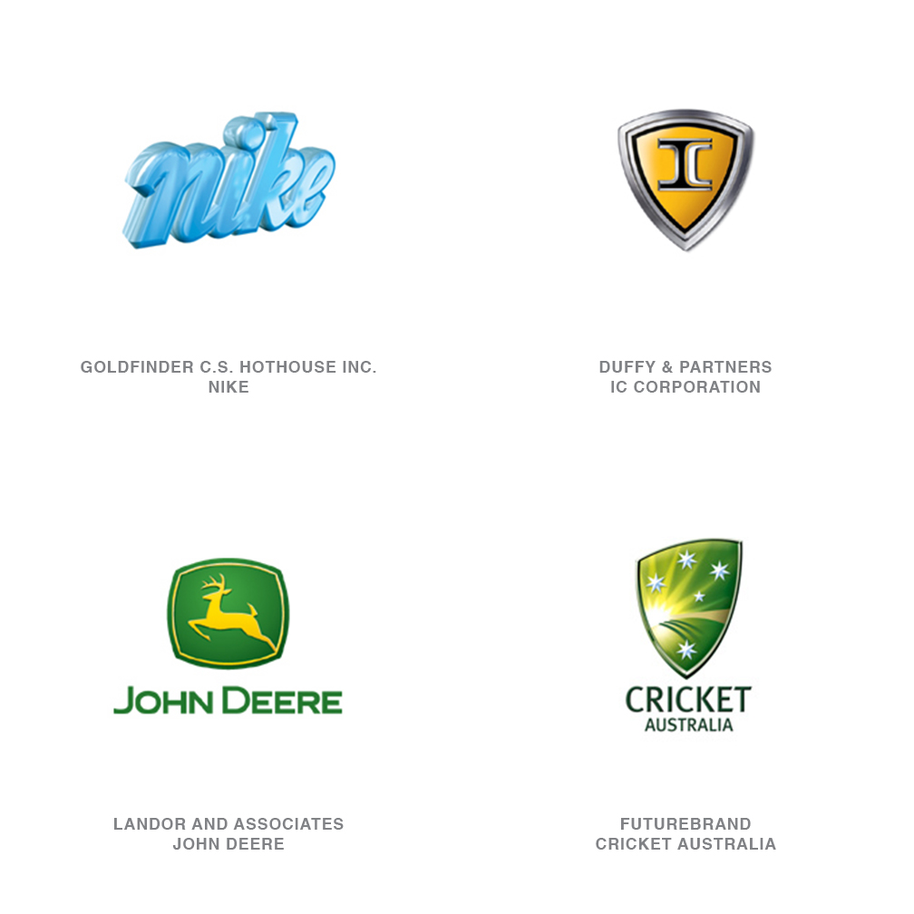
Mythic
This is a trend that is similar to Animorphic, a trend from last year. Designers hearken back to mythology and legend to imbue their clients-especially brand-new companies-with an instant history. It's the ancient equivalent of celebrity endorsement.
Nike may have gotten things started, but not all such designs are successful for two reasons. First, not everyone may understand your reference, no matter how apt. Second, like celebrities today, gods and goddesses of yesterday may have skeletons in their rock-hewn closets that may lend less that appropriate light on a client.
Follow the trends.
Logo design in your inbox. Subscribe to our monthly newsletter for the latest from LogoLounge.