The word "trend" has taken on a negative cast in recent years, particularly when the letter "y" is appended to it. "Trend" is actually a pretty innocuous phenomenon, though: Simply speaking, it is defined as a new line of direction. "Trendy," on the other hand, is what happens when everybody else starts stampeding in the same direction.
The ability to watch as design trends are taking shape-when the really courageous experimentation is happening and before imitation inevitably begins-is one of the best aspects of LogoLounge.com, says the website's founder, Bill Gardner.
"For the first time, designers have a real-time, front row seat to view what is happening in logo design," says Gardner, himself a talented designer and principal of Wichita-based Gardner Design, whose clients have included Pizza Hut, Cargill, Thermos, Nissan, Coleman, and Cox Communications, among many others.
In existence for just over a year, LogoLounge.com has quickly grown into a database of thousands and thousands of logos. Designers around the world upload new work to the site every day, and their peers are always watching to see what's new, and in turn, adding their work.
Gardner is watching, too. In 2002, he published (through Rockport Publishers) a 192-page book, "LogoLounge," which features the most exciting work on LogoLounge since its inception. An international panel of jurors selected the work that appeared in the book. Organizing the 2,000 logos required Gardner and his team to complete a great deal of sorting and organizing.
"This process forced us to find linkage between various logos. Some trends were expected, but some surprises emerged during the process," Gardner says. The following is a synopsis of the brave experimentation and exploration that is going on now. Some trends will emerge strongly while others will submerge and not be seen again. As part of a historical record, though, each is significant.
01 | Logo Trend
Droplets
Two of more droplets caught in the act of merging, usually symbolic of convergence or union. The Cingular logo is a wonderful example. The effect can also be used to express a technical or scientific association. Sometimes these shapes are flat, but other designs have highlights or shadows that give the impression of dimension.
02 | Logo Trend
Refinement
Over the past few years, there has been a return to simplicity in major corporate logos, ala Chermayeff & Geismar, which has never really strayed from this post. There are many more marks based in geometries, mixed with the simple twist of visual phrase. Possible reasons abound: Is this homage to the 1970s and the days of classic logo design? A greater reliance on the computer's natural geometric tendencies? Or is it possible that there are fewer and fewer designers out there with the hand skills necessary to craft more illustrative marks?
03 | Logo Trend
Pop
In the ongoing "Blast from the Past" tour, in which we trace a complete circle about every 30 years, companies that cater to the youth market as well as more boutique organizations have embraced the pop culture language of the late 1960s and early 1970s. Period letterforms, in particular, have enjoyed a resurgence in popularity, possibly the result of ready availability from companies such as House Industries and from less common sources such as rave flyers.
04 | Logo Trend
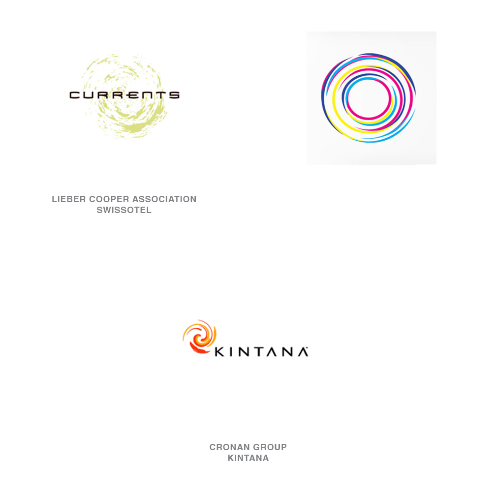
Natural Spirals
Imagine a few drops of dark paint dropped into a gallon of white paint, and then stirring just slightly. Or picture the circle of light created by a child as he draws circle after circle against the evening sky. These are the less-contrived vortex or spiral shapes found in nature, not in a computer program. There is a mix of chaos and hard geometry in these marks that suggests order and freedom at the same time.
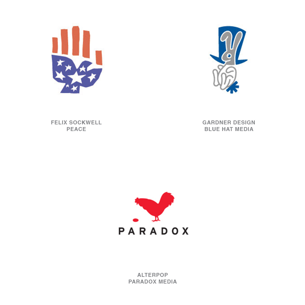
05 | Logo Trend
Animorphic
Animals continue to be used to help companies quickly develop equity in their identities by reflecting the particular positive attributes of an animal back onto the company. Although this is a tactic used more by small- to mid-sized companies, there are a few Fortune 500 companies that rely on it, too, such as Pacific Life's whale or John Deere's deer, recently rehoofed by Landor Design.
Although illustration styles vary widely, all of these logos rely on implied symbology.
06 | Logo Trend
Canted
How can you turn an unassuming geometric and make it remarkable? Cant it or wrap it onto a sphere, a task easily accomplished with a click of the house-not only by you, but by many other designers as well. Thanks to FreeHand and Illustrator, even very two-dimensional logo solutions can live in a faux 3-D world.
07 | Logo Trend
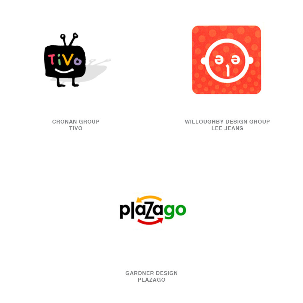
Alpha-Face
In an effort to make a company's identity more friendly and approachable, many a wordmark has been turned into a face or a little person. Letterforms and their many shapes have turned into eyes, noses, and mouths, and applied to a mark, ala Mr. Potato Head. Although these designs have been with us to some degree for generations, designers continue to find new and fresh iterations of the theme.
08 | Logo Trend
Shadows
Be they hard or gentle, shadows continue to give logos a sense of place. Sometimes shadows are used beneath a mark to give it a greater iconic presence: A logo that defies gravity must have supernatural powers of some sort. Other logos have used the shadow because, really, they had no baseline and the shadow tethers them to reality.
Illustrator Guy Billout's work has provided another, more skewed influence: His delightful way of twisting the natural phenomena of the shadow into performing contrary feats has inspired a number of designers to misshape shadows or set them off on strange trajectories.
09 | Logo Trend
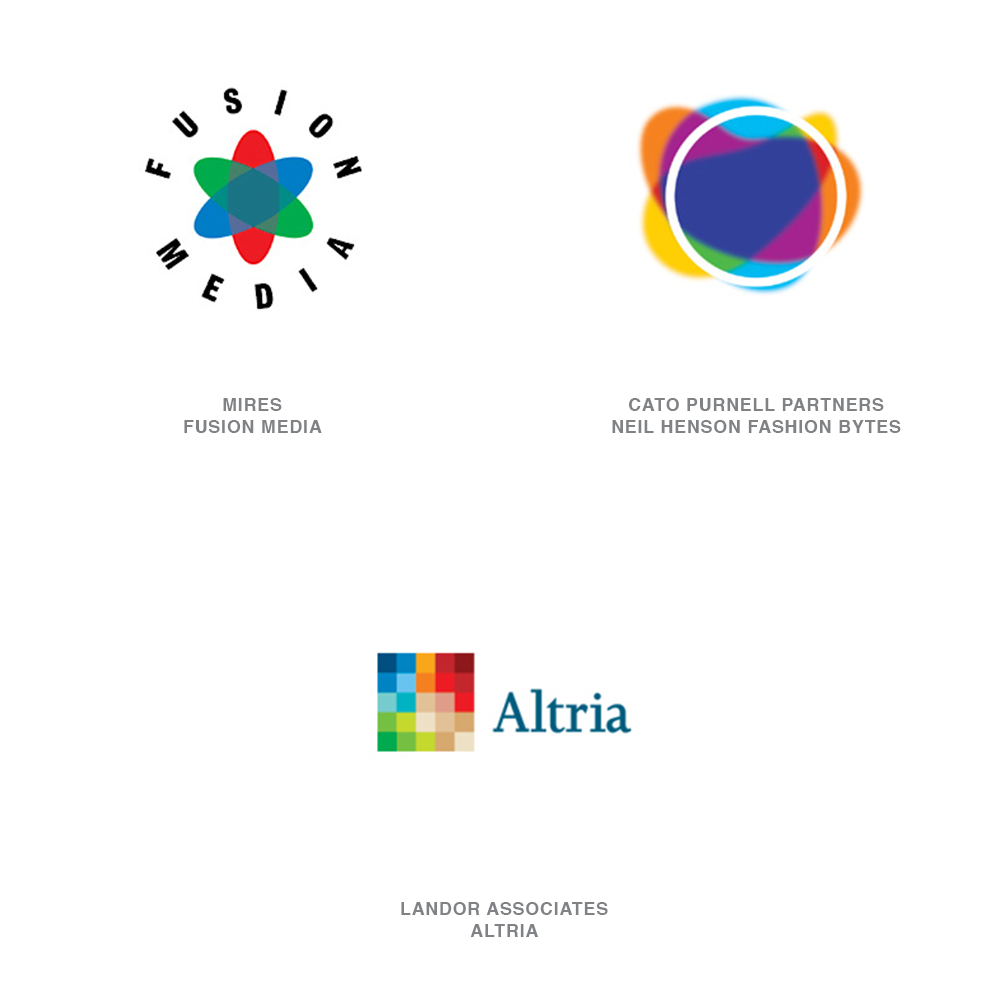
Transparency
Let's face it: The old rule that dictated that any really well-designed logo had to A) be reproducible in only one color, and B) that color had to be solid, not screened is gone. Sure, there are still challenges to be faced in playing fast and oo9se with these rules when a job must actually go on press, but the internet is much more forgiving.
There are many logos today, like the MSN butterfly, that have transparent qualities that reveal themselves through multiple layers. These designs can be very compelling especially since they are still novel enough to stand out from the already crowded world of flat one, two- and three-color logos.
10 | Logo Trend
Green
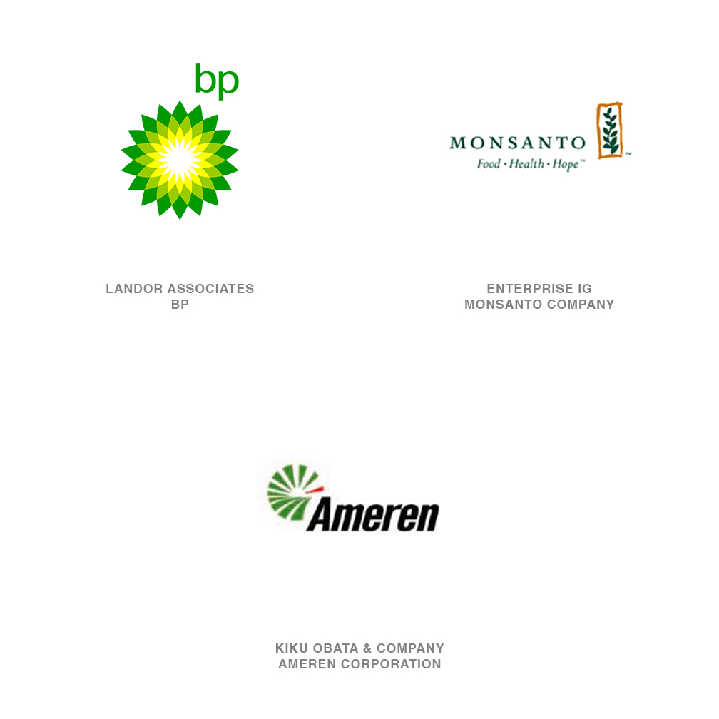
This is a literal and metaphorical trend. The roots for this can be traced back further, but Landor's greening of BP was a seminal effort. Although Raymond Loewy was using green and yellow in the historic BP logo, Landor gave it an environmental sense of place with the use of the flower/sun. Cargill, ADM, and Monsanto-all companies that might be likely to take an environmental hit-are all going green. It's a trend that is a breath of fresh air in an industry that is awash with red, white and blue. Public utilities have also picked up on this trend. But if it is overplayed, corporate green will soon become a tired joke to the public.
11 | Logo Trend
Punctuation
At one time, those punctuation marks at the top of the keyboard were reserved for expressing profanity. Today, they are all smileys. There is an entire shorthand language out there, created by youthful internet users, that is increasingly understood by the public at large.
The dotcoms almost played out this trend all by themselves. Every logo had an "@" in it. But as long as there are punctuation variations to explore, these marks will probably continue to be pounded out, even for logos that aren't for copywriters.
12 | Logo Trend
Labels
These are usually innocent little marks that are often simple silhouettes of innocuous objects. Inside the object, a name will be reversed out in a very legible font. These marks are often associated with hipper entities. The picture says what they do and the word says who they are. There's not much room for affectations-just a quick, painless, dose of honesty.
13 | Logo Trend
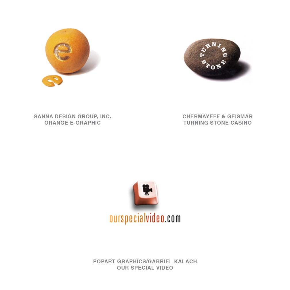
Photo Icons
These can be extremely well-done or extremely overdone. A simple photo icon from a CD stuffed with royalty-free images is isolated on a white background, and the name of the company is run beneath it. The approach is decidedly more elegant when the visual is supported with a twist of phrase, or when the phrase is supplied with a somehow unexpected visual.
14 | Logo Trend
Slinky
This is an effect that is one generation past the swoop. Instead of just making the short stroke, these marks loop in orderly patterns often above the company name. The curvilinear form is very reminiscent of the fun of a Spirograph, and perhaps these accurate but flowing forms suggest the feeling of accomplishment and satisfaction that two plastic gears, four pins, and a ballpoint pen can provide. It's a simple victory.
Then again, the form may simply spring from osmosis, absorbed from the screensavers we all share our spaces with, especially iTunes visual space. Their ability to fill space with light and a fluid image is calculated and fresh.
15 | Logo Trend
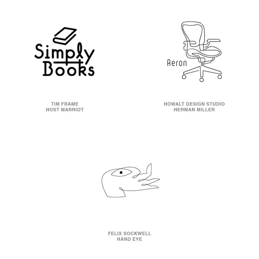
Wire
Put a pen to paper and craft an image with absolute economy and elegance of line. Picasso and Calder were creating art this way long before anyone embraced the form as a means of illustration or logo design. Felix Sockwell is the master of the technique today, and others have achieve success with it as well.
Because of its intensely artistic nature, designers may feel the saturation of this technique before clients and the public will. But wireform logos will probably continue to appear for at least a few more years unless a behemoth of a company adopts the style and wrangles the life right out of it.
So which of the trends are completely passe? Wings are worn out. Running men are exhausted. Swooshes should be squashed. Furthermore, water ripples, woodcut looks, and highly illustrated logos have seen their day. (A detailed woodcut of ripples would be especially tiresome.)
All this being said, it's time for back-pedaling. Even the most overused effect can be given new brilliance with the right twist. "I continue to be most captivated by solutions that break the rules but aren't blatant about it," Gardner says.
Follow the trends.
Logo design in your inbox. Subscribe to our monthly newsletter for the latest from LogoLounge.