Forecasting the near future in design is a reflection of society’s concerns. With such rapid shifts in technology and social media, consumers react to a fear of being left behind. At one time, keeping up with trends meant reading a monthly journal. Now, not only do we have to read daily blogs, but we are expected to contribute as well. Consumers who are not participating are growing ever more anxious about the specter of being technically eclipsed.
This chasm is revealed in the decisions made daily by brand designers. More and more identity design is trying to find a way to span the gap or choose a side. This carries forward to products and services that we build affinities with. Sports teams find themselves inventing updated generations of mascots. Long standing consumables are reinventing themselves with new packaging and product design.
Digital products and their user interfaces—UI—have become major drivers in the identity field. Consumers are predisposed to transfer confidence from one app or product to another if the experiences share a visual vernacular. Flat solid color is edging forward with momentum over images that mimic three-dimensional surfaces like glass, leather, or metal, for example. Simulating surfaces like these in an environment out of context is referred to as skeuomorphism. Though it is losing its grip, it is not going away: Clichés work because they are clichés.
Smaller companies are not afraid to adopt a logo that shows them at the size they are. More approachable is a good thing, if it is authentic. Larger companies are tending to loosen up a bit to avoid pretensions and work multiple generations. Ebay, USA Today, Windows and many more over the last year have adopted wordmarks and logos that eschew styles with shorter expiration dates.
Increasingly, consumers have become comfortable in their role as contributors and not just spectators. There is a universal desire to identify even the most niche elements. The ubiquitous profile pictures on Facebook, LinkedIn, or Twitter have turned into an opportunity to identify one’s self. Personal logos and monograms have reached epidemic proportions. Avatars allow us to self-edit and reinvent ourselves visually. This has become the micro-world of self-identification.
Designers are experimenting and making smart decisions for smart clients. Those satellite areas of exploration that haven’t bloomed into trends yet will either be tremendously successful or tragic failures. (Look to next year’s trend report for the results.) In the meantime, there are always those unexplained clusters of visual flotsam that must be mentioned in the “quit it” column: There are too many octopuses, snakes, elephants, peacocks, kangaroos, weathervanes, wheat stalks or heads, and anchors to count.
Now we come to the comments that are a mandatory opening to each year’s Trend Report—but they are worth repeating. At this writing, we have just over 204,000 logos on the LogoLounge site, submitted from designers in more than 100 countries worldwide. For this report, we examined more than 20,000 marks.
When you cull through and organize this many logos, trends are observed. The intention of this report is to share with you what we see, not make suggestions for what you should do. It is always easier to navigate to the future if you know where you have been. Seeing your trajectory allows you to predict where you will end up.
It’s been suggested this might better be called an “Evolution Report,” because it is actually a report on the evolution of our industry. Design is an evolving process. It’s our hopes that you will use these observations, together with your own wit and perception, to advance the field of logo design to the next level of brilliance.
This year we present you with the fifteen leading logo trends.
01 | Logo Trend
Here
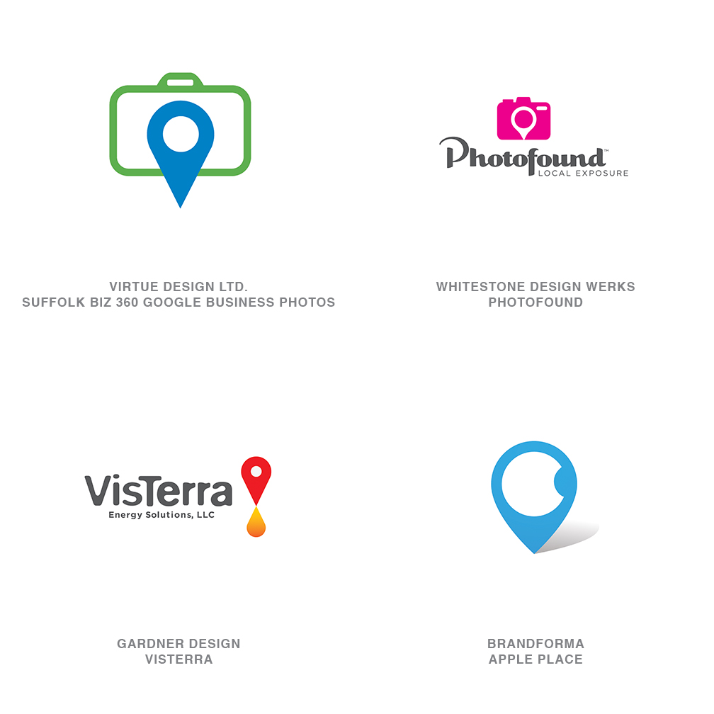
The iconic map pin has given way to the ubiquitous digital version of itself. A generation that has no use for an analog map also has no use for a tray full of stickpins with multicolored heads. Society navigates with GPS, and it marks its destinations with an iconic inverted drop shape that nods an homage to its predecessor. This icon has arguably entered the visual vocabulary of iconography as fast as any in recent memory.
Need to let someone know they have arrived? Drop a marker. The equity in this symbol is prepped for application and replaces the hackneyed iterations of an arrow, or an X, or a simple dot, to indicate that you have arrived. In logo design, place often is an important part of a story, and this malleable symbol is finding itself merged and modified to convey an even deeper message. It’s not every day that designers are presented with a virgin icon fresh for appropriation but here it is.
02 | Logo Trend
Crossed
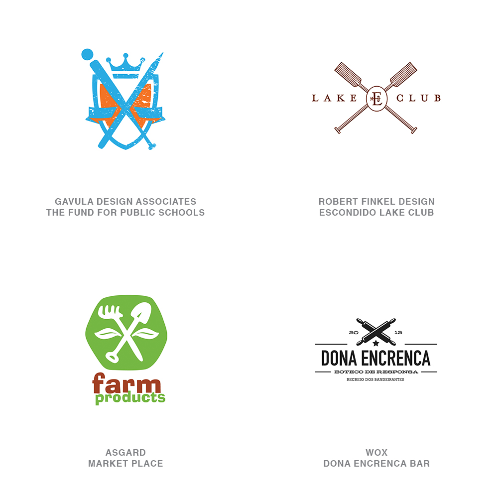
It’s been less than a handful of years since designers went on a binge with circles containing crossed anything, from arrows to lines to sticks. The standard solution usually involved a graphic being placed in each of the four quadrants formed by these items—a client’s initials, a foundation date, a name, a crown, a simple icon or symbol of some kind. The first few had a nice feel to them, but the proliferation of this kind of mark turned most of them into the punch line of their own joke.
The dust has cleared, and the frenetic pace of this design’s creation has slowed to a trickle. Better yet, it has shifted to another variant that is not nearly as packed with information as the previous models. These crossed components have a greater variety that often favors cooking utensils, tools, sporting equipment and the like. The X formed by these elements signifies a level of heritage normally associated with a pair of crossed swords. It’s a technique that lifts the regal nature of the client it represents and implies a certain sophistication even if it’s a pair of crossed plungers.
03 | Logo Trend
Wave
Subtlety plays an important role in this group, and it may well take a second look to see the connections. Generally these marks have a volume to them, but you can assume the substance is in flux. Imagine the simple motion of swirling wine in a glass and watching it stir from side to side in a settling fashion. It is a sign of movement but not in a rushed or torrid fashion. Rather, it is gentle and certainly under control.
Given time, these marks look as if they should come to rest, but the viewer’s better judgment suggests that the rolling nature of these icons is ongoing, like the tides. Such a simple visual gesture that’s pure in geometry and can express a complex rocking nature is refreshing. These appear to have a liquid quality to them, but as a logo design, it demonstrates an entity’s ability to contain a volatile substance and control the results.
04 | Logo Trend
Molecules
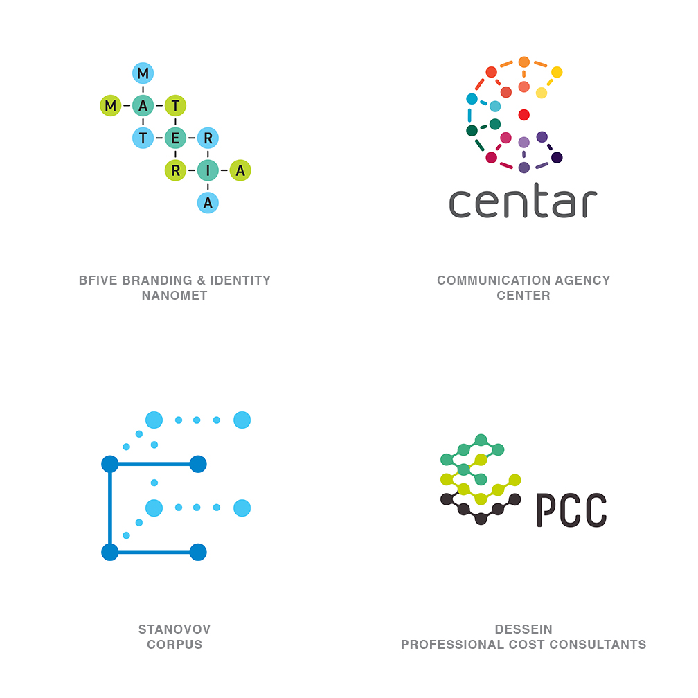
Think exacting and with specific purpose. Unlike cooking food, being off in a molecular recipe by one or two elements can kill you. This group of identities conveys concepts using a visual language that connotes an appreciation of precision—everything in its place and a place for everything. Though these identities may not represent a research lab or petrochemical endeavor, they do express the understanding on the client’s part for methodology.
The very geometric nature of these marks lets the consumer know that process is critical to success. There are no elements left to chance, and with perfection comes results. The circles connected by lines can represent the aspects of a large business that works together in harmony, or many coming together to create a greater whole. Variations in color demonstrate diversity or a seamless blending of disparate elements. This is how subjective designers present objective solutions to clients that demand a proof of outcome.
05 | Logo Trend
Nature Marks
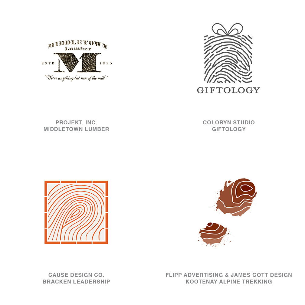
Long before DNA, we knew that nature’s manifestation of individualism existed everywhere. A thumbprint certainly spoke to the uniqueness of a human being, but the rings of a tree or the mapped topography of the land were equally effective marks of singularity. These patterns are immediately recognized for what they are even though each holds a clue to the originality of the entity.
Combining these thumbprints of nature as a surface treatment on a mark is seen as a way to address the unique and peculiar aspects of a client. Or it may be a way of indicating that every client or product or relationship is respected as individual. These prints are also the universal leveler as everyone has one regardless of our station in life. The print of every individual, regardless of wealth, religion, race, education, sex, or any other divisor, looks pretty much the same, but at the same time, each is unique—an imprimatur from Mother Nature.
06 | Logo Trend
Membrane
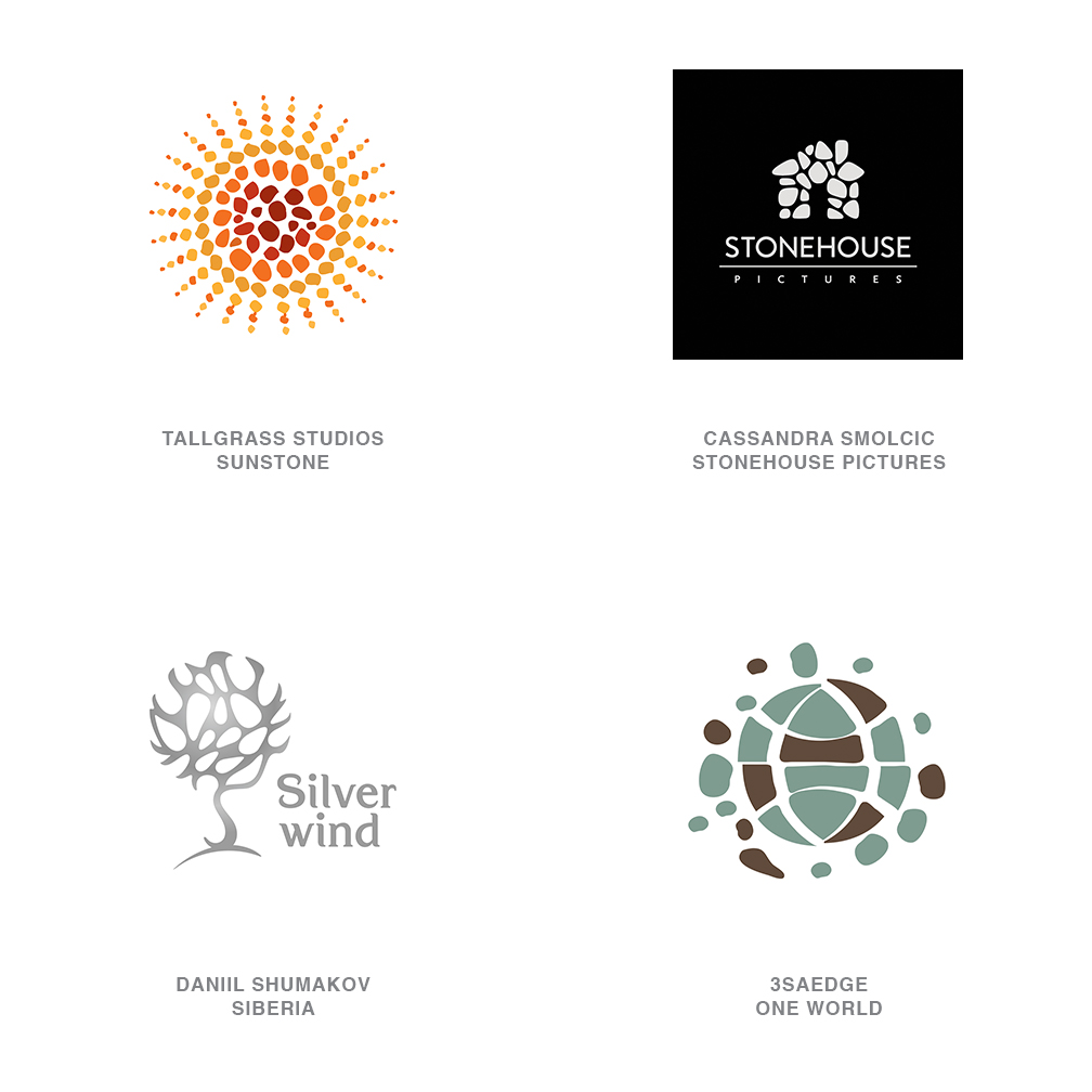
Pattern is no stranger to the world of logo design. Some of the most effective identities rely heavily on pattern to tell a story. More often than not the pattern is geometric in origin and displays a regular symmetry crafted from dots or squares or line work. The logos in this group are starting to use an irregular pattern that appears to be much more organic in nature. There is a consistency of positive and negative space to the arrangement, but it was formed from similar yet unique components.
Imagine the pattern created by camouflage, the epitome of regularity formed from irregularity. Or picture an arrangement of stones that are all of the same approximate size, but each is individual in form. The name for this category was adopted as a reference to the microscopic appearance of a cellular membrane that is constructed from similar units, connected in a random sequence, that creates a consistent surface. These marks demonstrate order and harmony drawn from dissonance and an appreciation of the beauty of differences brought together for a common good.
07 | Logo Trend
Formula
This, and this, and this, when brought together equals something much greater. Why not show those ingredients? Instead of showing s’mores, let’s break it down and show graham crackers and chocolate and marshmallows. The idea of stepping back from the finished product and showing the equation or the components responsible for getting you to the solution is what this group is about. The elements in the equation may be dramatically different but the combination tells the consumer a story and requires their participation to assemble a final conclusion.
These logos appear in a variety of styles, and whether the formula is displayed vertically or horizontally, there is usually a sequence to be followed for the result. Another connotation derived from this category is simplicity, as if there is someone telling the consumer, “It’s not that hard to understand.” Breaking a process into steps or showing its transparency is a good method of engaging the consumer with an educational message that coincidentally is also used to identify.
08 | Logo Trend
Bracketing
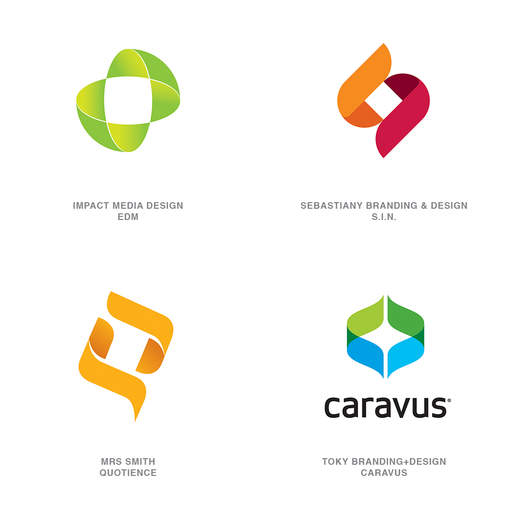
As different as these marks appear, a square in a negative white space is the connecting tissue. Generally, two elements of equal construction are pushed together to create a square- or diamond-shaped center which becomes the unwitting centerpiece of the logo. It’s a bit like two brackets that are uniquely designed and certainly have a message, but it’s never as much about the device as what is between them.
Here, two pieces make a whole and create something greater in the central area. Remove one of the pieces and there is no story, but squeezed together, they envelop one of the greatest of all products, potential. It is the light that is captured between. It is the known or unknown. It is the elusive result that only this firm can define and manifest. The beauty of showing potential is that the consumer is able to dream and fill in the blank with the answer that best serves his objective.
09 | Logo Trend
Eyelet
Imagine a world where you are not allowed to make any hard right turns, and you pretty much have the concept that leads to this genre of marks. Typically, these are built with a continuous motion monoline weight that may or may not be capped with a feature, or it may terminate into itself. Crossovers are certainly common, with a visual line break to convey dimension and continuity. There are many variants, but the use of a loop is how you navigate a hard right angle.
There is a pleasure in tracing the line with your eyes as it takes us on a bit of a journey. It demonstrates a sense of flow and flexibility and creates a solution that literally has an unexpected twist to it. Were you given enough rope, you could no doubt design your logo with it. These marks are approachable, friendly, and demonstrate a methodology by tracing a path from beginning to end.
10 | Logo Trend
Slash
The ubiquitous slash comes of age and has found a home in the realm of identity design. But what does it mean? The forward slash has tremendous flexibility and, aside from being a separator in networking or URL addresses, it is most commonly a symbol representing “or” in between two options. It also is at home as a divider between initials such as b/w for black and white, or as a divider in a fraction, or even as the mark for a spare at your local bowling lane.
In identity design, it is a clean visual substitute that allows us to connect or build separation between concepts or entities. The mark appears equally comfortable in a typographic solution or maybe used with a bit more wit between icons/visual elements or both. The acceptance of the slash is reminiscent of the avalanche of solutions using the @ symbol a number of years ago. Because of the almost invisible nature of the slash, it has much more utility and probably will be viewed much more like an ampersand or another letter in our alpha-arsenal.
11 | Logo Trend
Written
As this trend developed this year, it started as a recognition of the abundance of logos incorporating handwriting. There were some A-plus examples of cursive, for sure, but no additional theme was evident. The more I scrutinized the category, the more obvious the use of this script became as it appeared in a supporting shape to complete the message. Most of these looked as if a blackboard had been created in the shape of a “fill in the blank” for whatever the topic was.
Folks have been building type into shapes for years, and though that is a modest part of this trend, the overarching majority of these look like a barista at Starbucks has been busy designing logos when not filling out the menu boards at the store. This is an engaging way to tell a story, at a distance from a shape silhouette, and up close where the consumer can read the details. The handmade aspect of these solutions brings to the story a sense of care and attention to detail missing from the competitor’s soulless entity.
12 | Logo Trend
Line Craft
Probably most evident of any trend this year is the aesthetic and beauty associated with these marks and their understated elegance. The crafting of logos using a single stroke weight is not new, but it is in full display with nuances that keep the work fresh. These examples are mostly black on white, but there are exceptions with color that work as well. The illustration and the typography are both handled with even weights, which allows the copy to have a true sense of place.
Influences may come from icon systems that have been developed over the last several years using a non-scalable line weight to build consistency. A Charley Harper influence seems to come from the geometry applied to the illustrations. There is just enough line work to define shapes, but not enough to lay in tonality. A nod to the work of the 50s is also evident here, which is always a pleaser for generations still in love with that era.
13 | Logo Trend
Badges
A glance at this year’s logo crop turns up more crimped edges than a state fair pie contest. Badge logos are doing their best bottle cap impression with slow, wavy edges; tight, pointy, ziggurat edges; and every combo in between. It’s the diversity of filling that is keeping these interesting and that still allows the well-crafted version to stand out. Some of these are intended to be seal-like, and then others just use the shape as an enclosure.
There is an air of official-ese associated with these marks but also a wink that they can just as easily be irreverent and light-hearted. Dating back to the irregular edge created by an impression in a wax seal, this shape over the years found regularity in shape. Reminiscent of the gold seal applied to any document of importance, the shape still denotes an official stamp of approval, and designers are glad to promote this school of thought.
14 | Logo Trend
Banners
As a graphic device, the banner has enjoyed a significant ride with designers for a number of years. What was once a nice way to add a violator to a package or a website has this year found a place at the logo design table. An updated version of ribbons from years past, these banners only exist in a sharply creased and highly starched variation from the past. Generally, the banners are tipped with a rise to the right, leaving the italic passenger type in a perfectly erect state.
Occasionally the banners exist by themselves, but they are more often incorporated on or around a significant graphic element. Acting almost as a ribbon, these devices have the ability to serve as the background for a text message and also as a gathering and bundling device. The ribbon-like tips of the banners often are trimmed to contain a V tail evocative of an award. Because of the nature of the product this emulates, it allows a designer to build depth and layers into an otherwise flat solution.
15 | Logo Trend
Monograms
The art of personal aggrandizement is alive and well, and designers are busy doing their part to keep it fresh. Though monograms date back to 350 BC, they met their true renaissance starting in the mid-eighteenth century. This is when family crests gave way to a more democratic identifying motif that anyone could develop, regardless of his or her station in life. These solutions range from overly ornate to incredibly spartan in appearance and have been the outgrowth of the desire for everyone to have a mark of their own.
When there is little else to say about an individual, you can always bank on him having at least two initials you can rub together to create a monogram. There is a certain aura of elegance and formality that accompanies these, even though contemporary versions may not have the character to pull off being stitched on your shirt cuff. Name a fashion designer who doesn’t use a monogram of some sort on his or her merchandise. Considering the enormous trade in counterfeit fashion apparel and accessories, it helps prove the dollar value a logo can infuse in an industry.
Follow the trends.
Logo design in your inbox. Subscribe to our monthly newsletter for the latest from LogoLounge.